# Creating Number.Of.Days variable so that Start.Date and End.Date can be removed
# Month and Year are already variables, so Start.Date and End.Date become somewhat redundant
cause_of_death_data_clean$Number.Of.Days <- as.numeric(
as.Date(cause_of_death_data_clean$End.Date, format = "%m/%d/%Y") -
as.Date(cause_of_death_data_clean$Start.Date, format = "%m/%d/%Y")
)
cause_of_death_data_clean <- cause_of_death_data_clean %>%
dplyr::select(Jurisdiction.of.Occurrence, Year, Month, Number.Of.Days, everything())CDC Data Exercise
<<<<<<< Updated upstream
About the Data
This dataset is the ‘Monthly Provisional Counts of Deaths by Select Causes, 2020-2023’ though for the purpose of this exercise I am only using data from 2020-2022.
The dataset can be found here:
https://data.cdc.gov/NCHS/Monthly-Provisional-Counts-of-Deaths-by-Select-Cau/9dzk-mvmi/about_data
After cleaning the dataset contains the following list of variables:
- Jurisdiction of Occurrence
- Year
- Month
- Number Of Days
- All Cause
- Natural Cause
- Septicemia
- Malignant Neoplasms
- Diabetes Mellitus
- Alzheimer Disease
- Influenza and Pneumonia
- Chronic Lower Respiratory Diseases
- Other Diseases of Respiratory System
- Nephritis/Nephrotic Syndrome and Nephrosis
- Abnormal Findings (No Classifiable Diagnosis)
- Diseases of Heart
- Cerebrovascular Diseases
- Accidents/Unintentional Injuries
- Motor Vehicle Accidents
- Intentional Self Harm/Suicide
- Assault/Homicide
- Drug Overdose
- COVID 19/Multiple Cause of Death
- COVID 19/Underlying Cause of Death
Cleaning the Dataset
Load required package and load dataset.
# load libraries
library(ggplot2)
library(dplyr)
library(tidyr)
library(scales)
library(knitr)
library(kableExtra)
library(here)

# Specify the file path relative to the working directory
file_path <- here("cdcdata-exercise/causeofdeathdata.csv")

# Load the CSV file into a data frame
cause_of_death_data_clean <- read.csv(file_path, stringsAsFactors = FALSE)
Creating a new variable, to prepare for the removal of redundant variables in the next step.
Removing variables which contain junk text, and also getting rid of rows which contain no data. I also chose to filter out all data from 2023, since it was incomplete.
# Removing variables which display only 'Data not shown (6 month lag)'
# Removing Start.Date, End.Date, and Data.As.Of variables
cause_of_death_data_clean <- subset(cause_of_death_data_clean, select = -c(flag_accid, flag_mva, flag_suic, flag_homic, flag_drugod,Start.Date,End.Date,Data.As.Of))
# Removing rows with any NA values
cause_of_death_data_clean <- cause_of_death_data_clean[complete.cases(cause_of_death_data_clean), ]
# Filtering out data from the year 2023 because it is incomplete
cause_of_death_data_clean <- cause_of_death_data_clean %>%
filter(Year != 2023)Because of how variable names were formatted within the dataset, I added some code to make them more readable. I also altered the name of one variable which was very long and not practical for display purposes.
# Cleaning up variable names
clean_variable_names <- function(name) {
name <- gsub("\\.+", " ", gsub("\\.\\.", "/", name))
name <- gsub("Symptoms/Signs and Abnormal Clinical and Laboratory Findings/Not Elsewhere Classified", "Abnormal Findings (No Classifiable Diagnosis)", name)
return(name)
}
cause_of_death_data_clean <- cause_of_death_data_clean %>%
rename_with(clean_variable_names, everything())Visualizing the Data
Calculating percentages for the total count for each cause of death.
# Calculate percentages total
cause_counts_total <- cause_of_death_data_clean %>%
select(-c(`All Cause`, Year, Month, `Number Of Days`)) %>%
gather(key = "Cause of Death", value = "count", -`Jurisdiction of Occurrence`) %>%
group_by(`Cause of Death`) %>%
summarize(total_count = sum(count, na.rm = TRUE)) %>%
mutate(percentage = total_count / sum(total_count) * 100) %>%
arrange(desc(total_count))Creating a pie chart for the overall total for each cause of death.
# Create pie chart
pie_chart_total <- ggplot(cause_counts_total, aes(x = "", y = total_count, fill = `Cause of Death`)) +
geom_bar(stat = "identity") +
coord_polar("y", start = 0) +
labs(title = "Distribution of Causes of Death",
fill = "Cause of Death",
x = NULL, y = NULL,
caption = "Data source: CDC") +
theme_void() +
theme(legend.position = "right",
legend.text = element_text(size = 8),
legend.title = element_text(size = 10),
legend.key.size = unit(0.5, "lines"),
plot.title = element_text(size = 16),
plot.margin = margin(2, 6, 2, 2, "cm"),
legend.box.margin = margin(0, -10, 0, 0)) +
guides(fill = guide_legend(
keywidth = unit(0.5, "lines"),
label.position = "right",
label.hjust = 0
)) +
scale_fill_discrete(labels = paste0(cause_counts_total$`Cause of Death`, " (", round(cause_counts_total$percentage), "%)"))
# Adjustments
pie_chart_total <- pie_chart_total + theme(
plot.margin = margin(2, 2, 2, 2, "cm"),
plot.title = element_text(size = 16, hjust = 0.5, margin = margin(0, 0, 10, 0)),
plot.caption = element_text(size = 10, hjust = 0.5, margin = margin(10, 0, 0, 0))
)
# Show pie chart
print(pie_chart_total)
Grouping by month and cause of death, calculating total deaths per month, and calculating the percentage of total deaths each month. This is for graphing purposes.
# Group by month and cause of death
cause_counts_month <- cause_of_death_data_clean %>%
select(-c(`All Cause`, Year, `Number Of Days`)) %>%
gather(key = "Cause of Death", value = "count", -`Jurisdiction of Occurrence`, -Month) %>%
group_by(Month, `Cause of Death`) %>%
summarize(total_count = sum(count, na.rm = TRUE)) %>%
mutate(Month = factor(month.name[Month], levels = month.name)) %>%
arrange(Month, desc(total_count))
# Calculate total deaths for each month
total_deaths_month <- cause_counts_month %>%
group_by(Month) %>%
summarise(total_deaths = sum(total_count))
# Calculate percentage of total deaths for each month
total_deaths_month <- total_deaths_month %>%
mutate(percentage = total_deaths / sum(total_deaths) * 100)Plot stacked bar plot for causes of death per month.
# Create a stacked bar plot for causes of death by month
ggplot(cause_counts_month, aes(x = Month, y = total_count/1e6, fill = `Cause of Death`)) +
geom_bar(stat = "identity") +
scale_y_continuous(labels = function(x) paste0(format(x, big.mark = ",", scientific = FALSE), " million"),
breaks = pretty_breaks()) +
labs(title = "Total Causes of Death by Month",
x = "Month",
y = "Total Count") +
theme(axis.text.x = element_text(angle = 45, hjust = 1),
plot.title = element_text(hjust = 0.5))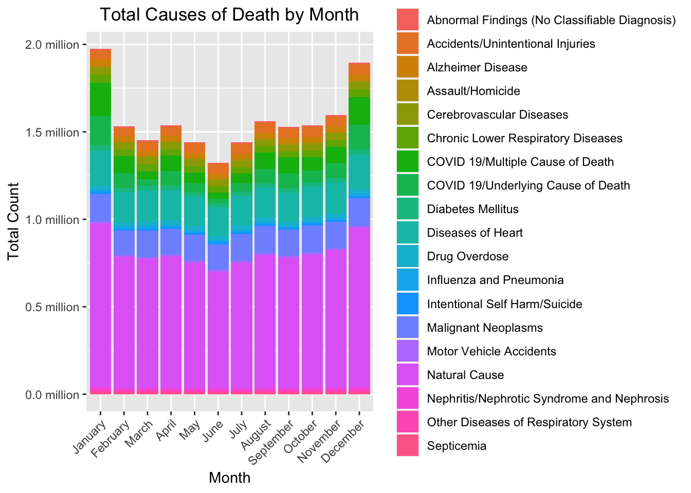
Plot bar graph for total number of deaths per month.
# Plot the bar graph for total number of deaths per month.
ggplot(total_deaths_month, aes(x = Month, y = total_deaths/1e6, fill = Month)) +
geom_bar(stat = "identity") +
scale_y_continuous(labels = function(x) paste0(format(x, big.mark = ",", scientific = FALSE), " million"),
breaks = pretty_breaks()) +
labs(title = "Total Deaths by Month",
x = "Month",
y = "Total Deaths") +
theme(axis.text.x = element_text(angle = 45, hjust = 1),
legend.position = "none")
Print table for total deaths per month.
# Print table of total deaths per month.
kable(total_deaths_month,
col.names = c("Month", "Total Deaths", "Percentage"),
format = "html",
digits = 2,
caption = "Total Deaths and Percentage by Month") %>%
kable_styling(full_width = FALSE) %>%
scroll_box(height = "200px")| Month | Total Deaths | Percentage |
|---|---|---|
| January | 1973713 | 10.49 |
| February | 1531031 | 8.14 |
| March | 1452402 | 7.72 |
| April | 1537652 | 8.17 |
| May | 1442009 | 7.66 |
| June | 1324227 | 7.04 |
| July | 1440256 | 7.65 |
| August | 1560359 | 8.29 |
| September | 1527357 | 8.12 |
| October | 1537261 | 8.17 |
| November | 1595771 | 8.48 |
| December | 1896740 | 10.08 |
Grouping by year and cause of death, calculating total deaths per year, and calculating the percentage of total deaths each year. This is for graphing purposes.
# Group by year and cause of death
cause_counts_year <- cause_of_death_data_clean %>%
select(-c(`All Cause`, Month, `Number Of Days`)) %>%
gather(key = "Cause of Death", value = "count", -`Jurisdiction of Occurrence`, -Year) %>%
group_by(Year, `Cause of Death`) %>%
summarize(total_count = sum(count, na.rm = TRUE)) %>%
arrange(Year, desc(total_count))
# Calculate total deaths for each year
total_deaths_year <- cause_counts_year %>%
group_by(Year) %>%
summarise(total_deaths = sum(total_count))
# Calculate percentage of total deaths for each year
total_deaths_year <- total_deaths_year %>%
mutate(percentage = total_deaths / sum(total_deaths) * 100)Plot bar graph for total number of death per year.
# Plot bar graph for total number of deaths per year.
ggplot(total_deaths_year, aes(x = Year, y = total_deaths/1e6, fill = as.factor(Year))) +
geom_bar(stat = "identity") +
scale_y_continuous(labels = function(x) paste0(format(x, big.mark = ",", scientific = FALSE), " million"),
breaks = pretty_breaks()) +
labs(title = "Total Deaths by Year",
x = "Year",
y = "Total Deaths") +
theme(axis.text.x = element_text(angle = 45, hjust = 1),
legend.position = "none")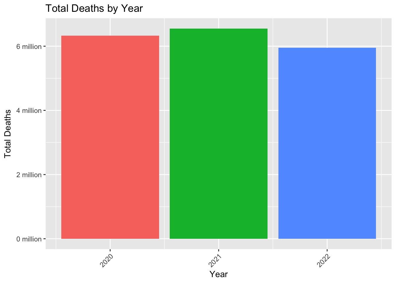
Print table for total deaths per year.
# Print table for total deaths per year.
kable(total_deaths_year,
col.names = c("Year", "Total Deaths", "Percentage"),
format = "html",
digits = 2,
caption = "Total Deaths and Percentage by Year") %>%
kable_styling(full_width = FALSE) %>%
scroll_box(height = "200px")| Year | Total Deaths | Percentage |
|---|---|---|
| 2020 | 6326855 | 33.62 |
| 2021 | 6544637 | 34.78 |
| 2022 | 5947286 | 31.60 |
Grouping by month, year, and cause of death, calculating total deaths per year per month, and calculating the percentage of total deaths each year and month. This is for graphing purposes.
# Group by year, month, and cause of death
cause_counts_year_month <- cause_of_death_data_clean %>%
select(-c(`All Cause`, `Number Of Days`)) %>%
gather(key = "Cause of Death", value = "count", -`Jurisdiction of Occurrence`, -Year, -Month) %>%
group_by(Year, Month, `Cause of Death`) %>%
summarize(total_count = sum(count, na.rm = TRUE)) %>%
arrange(Year, Month, desc(total_count))
# Calculate total deaths for each year and month
total_deaths_year_month <- cause_counts_year_month %>%
group_by(Year, Month) %>%
summarise(total_deaths = sum(total_count))
# Calculate percentage of total deaths for each year and month
total_deaths_year_month <- total_deaths_year_month %>%
mutate(percentage = total_deaths / sum(total_deaths) * 100)Plot stacked bar plot for causes of death per month per year.
# Create a stacked bar plot for causes of death by month and year
ggplot(cause_counts_year_month, aes(x = Month, y = total_count/1e6, fill = `Cause of Death`)) +
geom_bar(stat = "identity") +
facet_wrap(~Year) + # facet by year
scale_y_continuous(labels = function(x) paste0(format(x, big.mark = ",", scientific = FALSE), " million"),
breaks = pretty_breaks()) + # format y-axis labels
labs(title = "Total Causes of Death by Month & Year",
x = "Month",
y = "Total Count") +
theme(axis.text.x = element_text(angle = 45, hjust = 1),
plot.title = element_text(hjust = 0.5))
Print table for total deaths per month per year.
# Print table for total deaths per month per year.
kable(total_deaths_year_month,
col.names = c("Year", "Month", "Total Deaths", "Percentage"),
format = "html",
digits = 2,
caption = "Total Deaths and Percentage by Year and Month") %>%
kable_styling(full_width = FALSE) %>%
scroll_box(height = "200px")| Year | Month | Total Deaths | Percentage |
|---|---|---|---|
| 2020 | 1 | 458159 | 7.24 |
| 2020 | 2 | 424927 | 6.72 |
| 2020 | 3 | 476820 | 7.54 |
| 2020 | 4 | 640048 | 10.12 |
| 2020 | 5 | 532282 | 8.41 |
| 2020 | 6 | 453854 | 7.17 |
| 2020 | 7 | 519117 | 8.20 |
| 2020 | 8 | 513981 | 8.12 |
| 2020 | 9 | 465822 | 7.36 |
| 2020 | 10 | 501311 | 7.92 |
| 2020 | 11 | 585911 | 9.26 |
| 2020 | 12 | 754623 | 11.93 |
| 2021 | 1 | 774913 | 11.84 |
| 2021 | 2 | 545362 | 8.33 |
| 2021 | 3 | 495046 | 7.56 |
| 2021 | 4 | 466178 | 7.12 |
| 2021 | 5 | 462739 | 7.07 |
| 2021 | 6 | 431520 | 6.59 |
| 2021 | 7 | 457288 | 6.99 |
| 2021 | 8 | 584022 | 8.92 |
| 2021 | 9 | 616758 | 9.42 |
| 2021 | 10 | 568395 | 8.68 |
| 2021 | 11 | 535910 | 8.19 |
| 2021 | 12 | 606506 | 9.27 |
| 2022 | 1 | 740641 | 12.45 |
| 2022 | 2 | 560742 | 9.43 |
| 2022 | 3 | 480536 | 8.08 |
| 2022 | 4 | 431426 | 7.25 |
| 2022 | 5 | 446988 | 7.52 |
| 2022 | 6 | 438853 | 7.38 |
| 2022 | 7 | 463851 | 7.80 |
| 2022 | 8 | 462356 | 7.77 |
| 2022 | 9 | 444777 | 7.48 |
| 2022 | 10 | 467555 | 7.86 |
| 2022 | 11 | 473950 | 7.97 |
| 2022 | 12 | 535611 | 9.01 |
This section is contributed by Chaohua Li
Create synthetic data
We create a new dataset by scrambling the data from the original dataset. That means the values in each variable are sampled from the old values without replacement. Since the year, month, and days are considered the id for each observation, these variables won’t be scrambled.
#Create data set left that contains jurisdiction, year, month and days
left<-cause_of_death_data_clean[,c(1:4)]
#Create data set right that contains numbers of deaths for different causes
right<-cause_of_death_data_clean[,-c(1:4)]
#set seed for reproducible results
set.seed(456)
#define a new data frame synth that will contain scrambled values
synth <- right
#use a loop to scramble values without replacement in the dataset right
for (col in colnames(right)) {
#sample values without replacement for each variable
synth[[col]] <- sample(right[[col]], replace = FALSE)
}
#combine dataset left with the scrambled data right
synth2 <- cbind(left, synth)Summarizes and explores the synthetic data
Calculating percentages for the total count for each cause of death.
# Calculate percentages total
cause_counts_total <- synth2 %>%
select(-c(`All Cause`, Year, Month, `Number Of Days`)) %>%
gather(key = "Cause of Death", value = "count", -`Jurisdiction of Occurrence`) %>%
group_by(`Cause of Death`) %>%
summarize(total_count = sum(count, na.rm = TRUE)) %>%
mutate(percentage = total_count / sum(total_count) * 100) %>%
arrange(desc(total_count))Recreating a pie chart for the overall total for each cause of death.
# Create pie chart
pie_chart_total <- ggplot(cause_counts_total, aes(x = "", y = total_count, fill = `Cause of Death`)) +
geom_bar(stat = "identity") +
coord_polar("y", start = 0) +
labs(title = "Synthetic Data: Distribution of \nCauses of Death",
fill = "Cause of Death",
x = NULL, y = NULL,) +
theme_void() +
theme(legend.position = "right",
legend.text = element_text(size = 8),
legend.title = element_text(size = 10),
legend.key.size = unit(0.5, "lines"),
plot.title = element_text(size = 16),
plot.margin = margin(2, 6, 2, 2, "cm"),
legend.box.margin = margin(0, -10, 0, 0)) +
guides(fill = guide_legend(
keywidth = unit(0.5, "lines"),
label.position = "right",
label.hjust = 0
)) +
scale_fill_discrete(labels = paste0(cause_counts_total$`Cause of Death`, " (", round(cause_counts_total$percentage), "%)"))
# Adjustments
pie_chart_total <- pie_chart_total + theme(
plot.margin = margin(2, 2, 2, 2, "cm"),
plot.title = element_text(size = 16, hjust = 0.5, margin = margin(0, 0, 10, 0)),
plot.caption = element_text(size = 10, hjust = 0.5, margin = margin(10, 0, 0, 0))
)
# Show pie chart
print(pie_chart_total)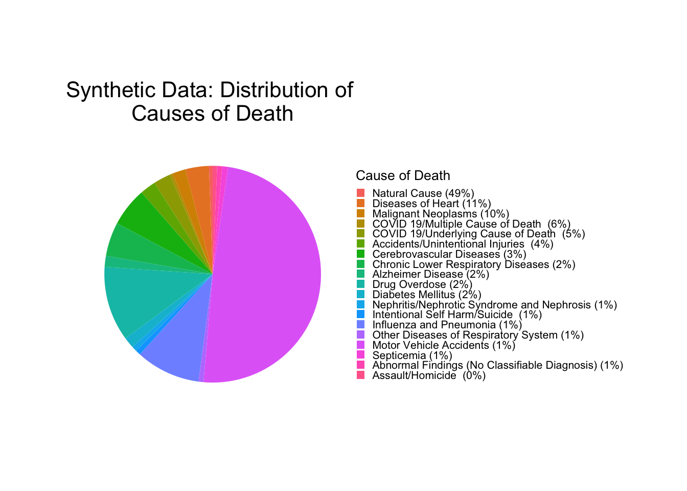
Because each cause of death in the synthetic dataset contains exactly the same group of values, so the totals for each cause are the same with the original dataset.
Grouping by month and cause of death, calculating total deaths per month, and calculating the percentage of total deaths each month. This is for graphing purposes.
# Group by month and cause of death
cause_counts_month <- synth2 %>%
select(-c(`All Cause`, Year, `Number Of Days`)) %>%
gather(key = "Cause of Death", value = "count", -`Jurisdiction of Occurrence`, -Month) %>%
group_by(Month, `Cause of Death`) %>%
summarize(total_count = sum(count, na.rm = TRUE)) %>%
mutate(Month = factor(month.name[Month], levels = month.name)) %>%
arrange(Month, desc(total_count))
# Calculate total deaths for each month
total_deaths_month <- cause_counts_month %>%
group_by(Month) %>%
summarise(total_deaths = sum(total_count))
# Calculate percentage of total deaths for each month
total_deaths_month <- total_deaths_month %>%
mutate(percentage = total_deaths / sum(total_deaths) * 100)Plot stacked bar plot for causes of death per month.
# Create a stacked bar plot for causes of death by month
ggplot(cause_counts_month, aes(x = Month, y = total_count/1e6, fill = `Cause of Death`)) +
geom_bar(stat = "identity") +
scale_y_continuous(labels = function(x) paste0(format(x, big.mark = ",", scientific = FALSE), " million"),
breaks = pretty_breaks()) +
labs(title = "Synthetic Data: Total Causes of \nDeath by Month",
x = "Month",
y = "Total Count") +
theme(axis.text.x = element_text(angle = 45, hjust = 1),
plot.title = element_text(hjust = 0.5))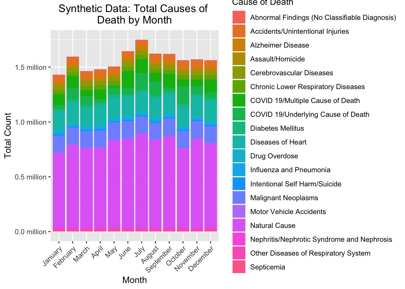
This bar plot looks different from the one using original data, because the random sampling broke the association between month and deaths due to different causes.
Plot bar graph for total number of deaths per month.
# Plot the bar graph for total number of deaths per month.
ggplot(total_deaths_month, aes(x = Month, y = total_deaths/1e6, fill = Month)) +
geom_bar(stat = "identity") +
scale_y_continuous(labels = function(x) paste0(format(x, big.mark = ",", scientific = FALSE), " million"),
breaks = pretty_breaks()) +
labs(title = "Synthetic Data:Total Deaths by Month",
x = "Month",
y = "Total Deaths") +
theme(axis.text.x = element_text(angle = 45, hjust = 1),
legend.position = "none")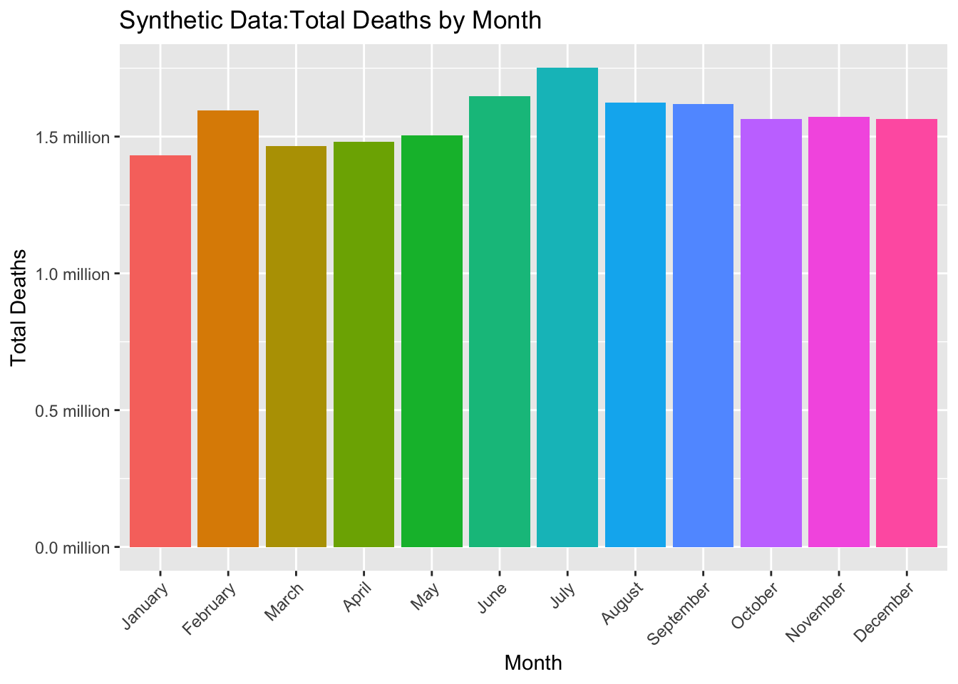
Print table for total deaths per month.
# Print table of total deaths per month.
kable(total_deaths_month,
col.names = c("Month", "Total Deaths", "Percentage"),
format = "html",
digits = 2,
caption = "Synthetic Data:Total Deaths and Percentage by Month") %>%
kable_styling(full_width = FALSE) %>%
scroll_box(height = "200px")| Month | Total Deaths | Percentage |
|---|---|---|
| January | 1431480 | 7.61 |
| February | 1595078 | 8.48 |
| March | 1465555 | 7.79 |
| April | 1480724 | 7.87 |
| May | 1504505 | 7.99 |
| June | 1646561 | 8.75 |
| July | 1750683 | 9.30 |
| August | 1623654 | 8.63 |
| September | 1619599 | 8.61 |
| October | 1564062 | 8.31 |
| November | 1572547 | 8.36 |
| December | 1564330 | 8.31 |
Differences in the distribution of deaths by month between original and synthetic data are also reflected in this table.
Grouping by year and cause of death, calculating total deaths per year, and calculating the percentage of total deaths each year. This is for graphing purposes.
# Group by year and cause of death
cause_counts_year <- synth2 %>%
select(-c(`All Cause`, Month, `Number Of Days`)) %>%
gather(key = "Cause of Death", value = "count", -`Jurisdiction of Occurrence`, -Year) %>%
group_by(Year, `Cause of Death`) %>%
summarize(total_count = sum(count, na.rm = TRUE)) %>%
arrange(Year, desc(total_count))
# Calculate total deaths for each year
total_deaths_year <- cause_counts_year %>%
group_by(Year) %>%
summarise(total_deaths = sum(total_count))
# Calculate percentage of total deaths for each year
total_deaths_year <- total_deaths_year %>%
mutate(percentage = total_deaths / sum(total_deaths) * 100)Plot bar graph for total number of death per year.
# Plot bar graph for total number of deaths per year.
ggplot(total_deaths_year, aes(x = Year, y = total_deaths/1e6, fill = as.factor(Year))) +
geom_bar(stat = "identity") +
scale_y_continuous(labels = function(x) paste0(format(x, big.mark = ",", scientific = FALSE), " million"),
breaks = pretty_breaks()) +
labs(title = "Synthetic Data:Total Deaths by Year",
x = "Year",
y = "Total Deaths") +
theme(axis.text.x = element_text(angle = 45, hjust = 1),
legend.position = "none")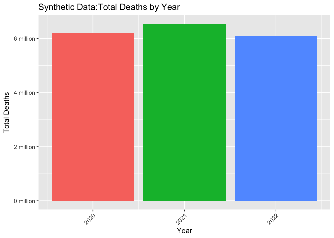
The distribution of deaths by year using synthetic data is very similar to that in the original data. But the table below does show the numbers are slightly different from the original results.
Print table for total deaths per year.
# Print table for total deaths per year.
kable(total_deaths_year,
col.names = c("Year", "Total Deaths", "Percentage"),
format = "html",
digits = 2,
caption = "Synthetic Data:Total Deaths and Percentage by Year") %>%
kable_styling(full_width = FALSE) %>%
scroll_box(height = "200px")| Year | Total Deaths | Percentage |
|---|---|---|
| 2020 | 6193867 | 32.91 |
| 2021 | 6531616 | 34.71 |
| 2022 | 6093295 | 32.38 |
Grouping by month, year, and cause of death, calculating total deaths per year per month, and calculating the percentage of total deaths each year and month. This is for graphing purposes.
# Group by year, month, and cause of death
cause_counts_year_month <- synth2 %>%
select(-c(`All Cause`, `Number Of Days`)) %>%
gather(key = "Cause of Death", value = "count", -`Jurisdiction of Occurrence`, -Year, -Month) %>%
group_by(Year, Month, `Cause of Death`) %>%
summarize(total_count = sum(count, na.rm = TRUE)) %>%
arrange(Year, Month, desc(total_count))
# Calculate total deaths for each year and month
total_deaths_year_month <- cause_counts_year_month %>%
group_by(Year, Month) %>%
summarise(total_deaths = sum(total_count))
# Calculate percentage of total deaths for each year and month
total_deaths_year_month <- total_deaths_year_month %>%
mutate(percentage = total_deaths / sum(total_deaths) * 100)Plot stacked bar plot for causes of death per month per year.
# Create a stacked bar plot for causes of death by month and year
ggplot(cause_counts_year_month, aes(x = Month, y = total_count/1e6, fill = `Cause of Death`)) +
geom_bar(stat = "identity") +
facet_wrap(~Year) + # facet by year
scale_y_continuous(labels = function(x) paste0(format(x, big.mark = ",", scientific = FALSE), " million"),
breaks = pretty_breaks()) + # format y-axis labels
labs(title = "Synthetic Data:Total Causes of Death \nby Month & Year",
x = "Month",
y = "Total Count") +
theme(axis.text.x = element_text(angle = 45, hjust = 1),
plot.title = element_text(hjust = 0.5))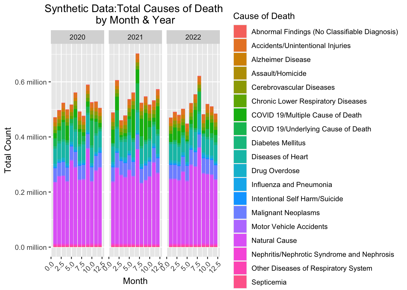
The distribution of deaths by year and month using synthetic data looks different from the original results. This is due to the random sampling process which broke the original pattern.
Print table for total deaths per month per year.
# Print table for total deaths per month per year.
kable(total_deaths_year_month,
col.names = c("Year", "Month", "Total Deaths", "Percentage"),
format = "html",
digits = 2,
caption = "Synthetic Data:Total Deaths and Percentage \nby Year and Month") %>%
kable_styling(full_width = FALSE) %>%
scroll_box(height = "600px")| Year | Month | Total Deaths | Percentage |
|---|---|---|---|
| 2020 | 1 | 472058 | 7.62 |
| 2020 | 2 | 497446 | 8.03 |
| 2020 | 3 | 524118 | 8.46 |
| 2020 | 4 | 500293 | 8.08 |
| 2020 | 5 | 518146 | 8.37 |
| 2020 | 6 | 561612 | 9.07 |
| 2020 | 7 | 492192 | 7.95 |
| 2020 | 8 | 477343 | 7.71 |
| 2020 | 9 | 589829 | 9.52 |
| 2020 | 10 | 526264 | 8.50 |
| 2020 | 11 | 528635 | 8.53 |
| 2020 | 12 | 505931 | 8.17 |
| 2021 | 1 | 488815 | 7.48 |
| 2021 | 2 | 606530 | 9.29 |
| 2021 | 3 | 461131 | 7.06 |
| 2021 | 4 | 478082 | 7.32 |
| 2021 | 5 | 537713 | 8.23 |
| 2021 | 6 | 561448 | 8.60 |
| 2021 | 7 | 703027 | 10.76 |
| 2021 | 8 | 524714 | 8.03 |
| 2021 | 9 | 546985 | 8.37 |
| 2021 | 10 | 517421 | 7.92 |
| 2021 | 11 | 532602 | 8.15 |
| 2021 | 12 | 573148 | 8.77 |
| 2022 | 1 | 470607 | 7.72 |
| 2022 | 2 | 491102 | 8.06 |
| 2022 | 3 | 480306 | 7.88 |
| 2022 | 4 | 502349 | 8.24 |
| 2022 | 5 | 448646 | 7.36 |
| 2022 | 6 | 523501 | 8.59 |
| 2022 | 7 | 555464 | 9.12 |
| 2022 | 8 | 621597 | 10.20 |
| 2022 | 9 | 482785 | 7.92 |
| 2022 | 10 | 520377 | 8.54 |
| 2022 | 11 | 511310 | 8.39 |
| 2022 | 12 | 485251 | 7.96 |
=======
About the Data
This dataset is the ‘Monthly Provisional Counts of Deaths by Select Causes, 2020-2023’ though for the purpose of this exercise I am only using data from 2020-2022.
The dataset can be found here:
https://data.cdc.gov/NCHS/Monthly-Provisional-Counts-of-Deaths-by-Select-Cau/9dzk-mvmi/about_data
After cleaning the dataset contains the following list of variables:
- Jurisdiction of Occurrence
- Year
- Month
- Number Of Days
- All Cause
- Natural Cause
- Septicemia
- Malignant Neoplasms
- Diabetes Mellitus
- Alzheimer Disease
- Influenza and Pneumonia
- Chronic Lower Respiratory Diseases
- Other Diseases of Respiratory System
- Nephritis/Nephrotic Syndrome and Nephrosis
- Abnormal Findings (No Classifiable Diagnosis)
- Diseases of Heart
- Cerebrovascular Diseases
- Accidents/Unintentional Injuries
- Motor Vehicle Accidents
- Intentional Self Harm/Suicide
- Assault/Homicide
- Drug Overdose
- COVID 19/Multiple Cause of Death
- COVID 19/Underlying Cause of Death
Cleaning the Dataset
Load required package and load dataset.
# load libraries
library(ggplot2)
library(dplyr)
library(tidyr)
library(scales)
library(knitr)
library(kableExtra)
library(here)
# Specify the file path relative to the working directory
file_path <- "cdcdata-exercise/causeofdeathdata.csv"
# Load the CSV file into a data frame
cause_of_death_data_clean <- read.csv(here("cdcdata-exercise", "causeofdeathdata.csv"), stringsAsFactors = FALSE)Creating a new variable, to prepare for the removal of redundant variables in the next step.
# Creating Number.Of.Days variable so that Start.Date and End.Date can be removed
# Month and Year are already variables, so Start.Date and End.Date become somewhat redundant
cause_of_death_data_clean$Number.Of.Days <- as.numeric(
  as.Date(cause_of_death_data_clean$End.Date, format = "%m/%d/%Y") -
    as.Date(cause_of_death_data_clean$Start.Date, format = "%m/%d/%Y")
)
cause_of_death_data_clean <- cause_of_death_data_clean %>%
  dplyr::select(Jurisdiction.of.Occurrence, Year, Month, Number.Of.Days, everything())
Removing variables which contain junk text, and also getting rid of rows which contain no data. I also chose to filter out all data from 2023, since it was incomplete.
# Removing variables which display only 'Data not shown (6 month lag)'
# Removing Start.Date, End.Date, and Data.As.Of variables
cause_of_death_data_clean <- subset(cause_of_death_data_clean, select = -c(flag_accid, flag_mva, flag_suic, flag_homic, flag_drugod,Start.Date,End.Date,Data.As.Of))

# Removing rows with any NA values
cause_of_death_data_clean <- cause_of_death_data_clean[complete.cases(cause_of_death_data_clean), ]

# Filtering out data from the year 2023 because it is incomplete
cause_of_death_data_clean <- cause_of_death_data_clean %>%
  filter(Year != 2023)
Because of how variable names were formatted within the dataset, I added some code to make them more readable. I also altered the name of one variable which was very long and not practical for display purposes.
# Cleaning up variable names

clean_variable_names <- function(name) {
  name <- gsub("\\.+", " ", gsub("\\.\\.", "/", name))
  name <- gsub("Symptoms/Signs and Abnormal Clinical and Laboratory Findings/Not Elsewhere Classified", "Abnormal Findings (No Classifiable Diagnosis)", name)
  return(name)
}

cause_of_death_data_clean <- cause_of_death_data_clean %>%
  rename_with(clean_variable_names, everything())
Visualizing the Data
Calculating percentages for the total count for each cause of death.
# Calculate percentages total
cause_counts_total <- cause_of_death_data_clean %>%
  select(-c(`All Cause`, Year, Month, `Number Of Days`)) %>%
  gather(key = "Cause of Death", value = "count", -`Jurisdiction of Occurrence`) %>%
  group_by(`Cause of Death`) %>%
  summarize(total_count = sum(count, na.rm = TRUE)) %>%
  mutate(percentage = total_count / sum(total_count) * 100) %>%
  arrange(desc(total_count))
Creating a pie chart for the overall total for each cause of death.
# Create pie chart
pie_chart_total <- ggplot(cause_counts_total, aes(x = "", y = total_count, fill = `Cause of Death`)) +
  geom_bar(stat = "identity") +
  coord_polar("y", start = 0) +
  labs(title = "Distribution of Causes of Death",
       fill = "Cause of Death",
       x = NULL, y = NULL,
       caption = "Data source: CDC") +
  theme_void() +
  theme(legend.position = "right",
        legend.text = element_text(size = 8),
        legend.title = element_text(size = 10),
        legend.key.size = unit(0.5, "lines"),
        plot.title = element_text(size = 16),
        plot.margin = margin(2, 6, 2, 2, "cm"),
        legend.box.margin = margin(0, -10, 0, 0)) +
  guides(fill = guide_legend(
    keywidth = unit(0.5, "lines"),
    label.position = "right",
    label.hjust = 0
  )) +
  scale_fill_discrete(labels = paste0(cause_counts_total$`Cause of Death`, " (", round(cause_counts_total$percentage), "%)"))

# Adjustments
pie_chart_total <- pie_chart_total + theme(
  plot.margin = margin(2, 2, 2, 2, "cm"),
  plot.title = element_text(size = 16, hjust = 0.5, margin = margin(0, 0, 10, 0)),
  plot.caption = element_text(size = 10, hjust = 0.5, margin = margin(10, 0, 0, 0))
)

# Show pie chart
print(pie_chart_total)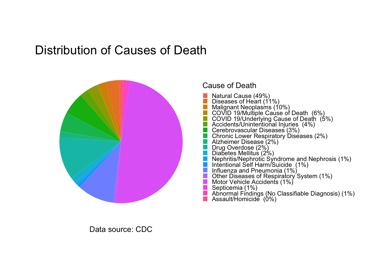
Grouping by month and cause of death, calculating total deaths per month, and calculating the percentage of total deaths each month. This is for graphing purposes.
# Group by month and cause of death
cause_counts_month <- cause_of_death_data_clean %>%
  select(-c(`All Cause`, Year, `Number Of Days`)) %>%
  gather(key = "Cause of Death", value = "count", -`Jurisdiction of Occurrence`, -Month) %>%
  group_by(Month, `Cause of Death`) %>%
  summarize(total_count = sum(count, na.rm = TRUE)) %>%
  mutate(Month = factor(month.name[Month], levels = month.name)) %>%
  arrange(Month, desc(total_count))

# Calculate total deaths for each month
total_deaths_month <- cause_counts_month %>%
  group_by(Month) %>%
  summarise(total_deaths = sum(total_count))

# Calculate percentage of total deaths for each month
total_deaths_month <- total_deaths_month %>%
  mutate(percentage = total_deaths / sum(total_deaths) * 100)
Plot stacked bar plot for causes of death per month.
# Create a stacked bar plot for causes of death by month
ggplot(cause_counts_month, aes(x = Month, y = total_count/1e6, fill = `Cause of Death`)) +
  geom_bar(stat = "identity") +
  scale_y_continuous(labels = function(x) paste0(format(x, big.mark = ",", scientific = FALSE), " million"),
                     breaks = pretty_breaks()) +
  labs(title = "Total Causes of Death by Month",
       x = "Month",
       y = "Total Count") +
  theme(axis.text.x = element_text(angle = 45, hjust = 1),
        plot.title = element_text(hjust = 0.5))
Plot bar graph for total number of deaths per month.
# Plot the bar graph for total number of deaths per month.
ggplot(total_deaths_month, aes(x = Month, y = total_deaths/1e6, fill = Month)) +
  geom_bar(stat = "identity") +
  scale_y_continuous(labels = function(x) paste0(format(x, big.mark = ",", scientific = FALSE), " million"),
                     breaks = pretty_breaks()) +
  labs(title = "Total Deaths by Month",
       x = "Month",
       y = "Total Deaths") +
  theme(axis.text.x = element_text(angle = 45, hjust = 1),
        legend.position = "none")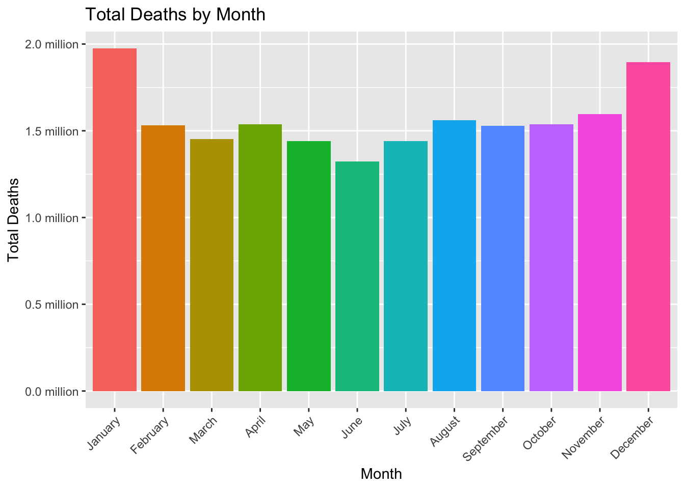
Print table for total deaths per month.
# Print table of total deaths per month.
kable(total_deaths_month,
      col.names = c("Month", "Total Deaths", "Percentage"),
      format = "html",
      digits = 2,
      caption = "Total Deaths and Percentage by Month") %>%
  kable_styling(full_width = FALSE) %>%
scroll_box(height = "200px")| Month | Total Deaths | Percentage |
|---|---|---|
| January | 1973713 | 10.49 |
| February | 1531031 | 8.14 |
| March | 1452402 | 7.72 |
| April | 1537652 | 8.17 |
| May | 1442009 | 7.66 |
| June | 1324227 | 7.04 |
| July | 1440256 | 7.65 |
| August | 1560359 | 8.29 |
| September | 1527357 | 8.12 |
| October | 1537261 | 8.17 |
| November | 1595771 | 8.48 |
| December | 1896740 | 10.08 |
Grouping by year and cause of death, calculating total deaths per year, and calculating the percentage of total deaths each year. This is for graphing purposes.
# Group by year and cause of death
cause_counts_year <- cause_of_death_data_clean %>%
  select(-c(`All Cause`, Month, `Number Of Days`)) %>%
  gather(key = "Cause of Death", value = "count", -`Jurisdiction of Occurrence`, -Year) %>%
  group_by(Year, `Cause of Death`) %>%
  summarize(total_count = sum(count, na.rm = TRUE)) %>%
  arrange(Year, desc(total_count))

# Calculate total deaths for each year
total_deaths_year <- cause_counts_year %>%
  group_by(Year) %>%
  summarise(total_deaths = sum(total_count))

# Calculate percentage of total deaths for each year
total_deaths_year <- total_deaths_year %>%
  mutate(percentage = total_deaths / sum(total_deaths) * 100)
Plot bar graph for total number of death per year.
# Plot bar graph for total number of deaths per year.
ggplot(total_deaths_year, aes(x = Year, y = total_deaths/1e6, fill = as.factor(Year))) +
  geom_bar(stat = "identity") +
  scale_y_continuous(labels = function(x) paste0(format(x, big.mark = ",", scientific = FALSE), " million"),
                     breaks = pretty_breaks()) +
  labs(title = "Total Deaths by Year",
       x = "Year",
       y = "Total Deaths") +
  theme(axis.text.x = element_text(angle = 45, hjust = 1),
        legend.position = "none")
Print table for total deaths per year.
# Print table for total deaths per year.
kable(total_deaths_year,
      col.names = c("Year", "Total Deaths", "Percentage"),
      format = "html",
      digits = 2,
      caption = "Total Deaths and Percentage by Year") %>%
  kable_styling(full_width = FALSE) %>%
scroll_box(height = "200px")| Year | Total Deaths | Percentage |
|---|---|---|
| 2020 | 6326855 | 33.62 |
| 2021 | 6544637 | 34.78 |
| 2022 | 5947286 | 31.60 |
Grouping by month, year, and cause of death, calculating total deaths per year per month, and calculating the percentage of total deaths each year and month. This is for graphing purposes.
# Group by year, month, and cause of death
cause_counts_year_month <- cause_of_death_data_clean %>%
  select(-c(`All Cause`, `Number Of Days`)) %>%
  gather(key = "Cause of Death", value = "count", -`Jurisdiction of Occurrence`, -Year, -Month) %>%
  group_by(Year, Month, `Cause of Death`) %>%
  summarize(total_count = sum(count, na.rm = TRUE)) %>%
  arrange(Year, Month, desc(total_count))

# Calculate total deaths for each year and month
total_deaths_year_month <- cause_counts_year_month %>%
  group_by(Year, Month) %>%
  summarise(total_deaths = sum(total_count))

# Calculate percentage of total deaths for each year and month
total_deaths_year_month <- total_deaths_year_month %>%
  mutate(percentage = total_deaths / sum(total_deaths) * 100)
Plot stacked bar plot for causes of death per month per year.
# Create a stacked bar plot for causes of death by month and year
ggplot(cause_counts_year_month, aes(x = Month, y = total_count/1e6, fill = `Cause of Death`)) +
  geom_bar(stat = "identity") +
  facet_wrap(~Year) +  # facet by year
  scale_y_continuous(labels = function(x) paste0(format(x, big.mark = ",", scientific = FALSE), " million"),
                     breaks = pretty_breaks()) + # format y-axis labels
  labs(title = "Total Causes of Death by Month & Year",
       x = "Month",
       y = "Total Count") +
  theme(axis.text.x = element_text(angle = 45, hjust = 1),
        plot.title = element_text(hjust = 0.5))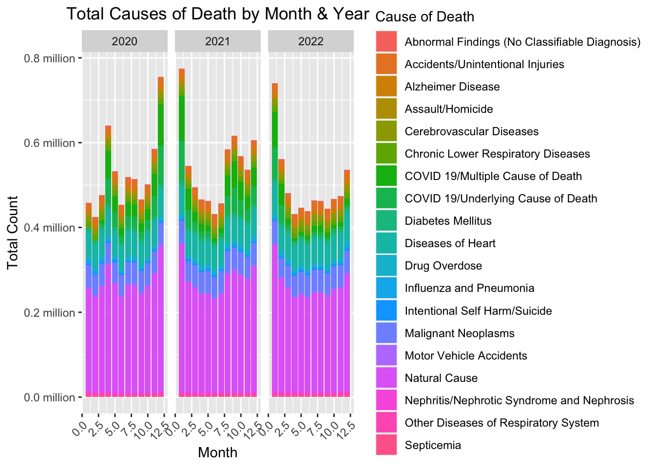
Print table for total deaths per month per year.
# Print table for total deaths per month per year.
kable(total_deaths_year_month,
      col.names = c("Year", "Month", "Total Deaths", "Percentage"),
      format = "html",
      digits = 2,
      caption = "Total Deaths and Percentage by Year and Month") %>%
  kable_styling(full_width = FALSE) %>%
scroll_box(height = "200px")| Year | Month | Total Deaths | Percentage |
|---|---|---|---|
| 2020 | 1 | 458159 | 7.24 |
| 2020 | 2 | 424927 | 6.72 |
| 2020 | 3 | 476820 | 7.54 |
| 2020 | 4 | 640048 | 10.12 |
| 2020 | 5 | 532282 | 8.41 |
| 2020 | 6 | 453854 | 7.17 |
| 2020 | 7 | 519117 | 8.20 |
| 2020 | 8 | 513981 | 8.12 |
| 2020 | 9 | 465822 | 7.36 |
| 2020 | 10 | 501311 | 7.92 |
| 2020 | 11 | 585911 | 9.26 |
| 2020 | 12 | 754623 | 11.93 |
| 2021 | 1 | 774913 | 11.84 |
| 2021 | 2 | 545362 | 8.33 |
| 2021 | 3 | 495046 | 7.56 |
| 2021 | 4 | 466178 | 7.12 |
| 2021 | 5 | 462739 | 7.07 |
| 2021 | 6 | 431520 | 6.59 |
| 2021 | 7 | 457288 | 6.99 |
| 2021 | 8 | 584022 | 8.92 |
| 2021 | 9 | 616758 | 9.42 |
| 2021 | 10 | 568395 | 8.68 |
| 2021 | 11 | 535910 | 8.19 |
| 2021 | 12 | 606506 | 9.27 |
| 2022 | 1 | 740641 | 12.45 |
| 2022 | 2 | 560742 | 9.43 |
| 2022 | 3 | 480536 | 8.08 |
| 2022 | 4 | 431426 | 7.25 |
| 2022 | 5 | 446988 | 7.52 |
| 2022 | 6 | 438853 | 7.38 |
| 2022 | 7 | 463851 | 7.80 |
| 2022 | 8 | 462356 | 7.77 |
| 2022 | 9 | 444777 | 7.48 |
| 2022 | 10 | 467555 | 7.86 |
| 2022 | 11 | 473950 | 7.97 |
| 2022 | 12 | 535611 | 9.01 |
Stashed changes