# Load here and readr for data reading
library(here)
library(readr)Fitting Exercise
Exercise 8
Importing Data
The first step was to import and read the data from the csv file.
First, the required libraries ‘here’ and ‘readr’ were loaded.
Next, the data was read from the csv file.
# Use the here function to specify the file path
data_path <- here("fitting-exercise", "Mavoglurant_A2121_nmpk.csv")

# Load the data
data <- read_csv(data_path)
Printing the first few rows of the dataset, to make sure it loaded correctly.
# Inspect the first few rows of the data to ensure it's loaded correctly
head(data)
# A tibble: 6 × 17
ID CMT EVID EVI2 MDV DV LNDV AMT TIME DOSE OCC RATE AGE
<dbl> <dbl> <dbl> <dbl> <dbl> <dbl> <dbl> <dbl> <dbl> <dbl> <dbl> <dbl> <dbl>
1 793 1 1 1 1 0 0 25 0 25 1 75 42
2 793 2 0 0 0 491 6.20 0 0.2 25 1 0 42
3 793 2 0 0 0 605 6.40 0 0.25 25 1 0 42
4 793 2 0 0 0 556 6.32 0 0.367 25 1 0 42
5 793 2 0 0 0 310 5.74 0 0.533 25 1 0 42
6 793 2 0 0 0 237 5.47 0 0.7 25 1 0 42
# ℹ 4 more variables: SEX <dbl>, RACE <dbl>, WT <dbl>, HT <dbl>
Loading in ggplot2 for plotting.
Plotting ‘DV’ as a function of time, stratified by ‘DOSE’ with ‘ID’ as a grouping factor. This provides a quick visual overview of the data.
# Load ggplot2 for plotting
library(ggplot2)

# Define colors
colors <- c("#5c88da", "#84bd00", "#ffcd00")

ggplot(data, aes(x = TIME, y = DV, group = ID, color = as.factor(DOSE))) +
  geom_line() +
  scale_color_manual(values = colors) +
  facet_wrap(~ DOSE, scales = "free", ncol = 1) +
  labs(title = "DV vs. Time Stratified by DOSE", x = "Time", y = "DV", color = "DOSE") +
  theme_minimal()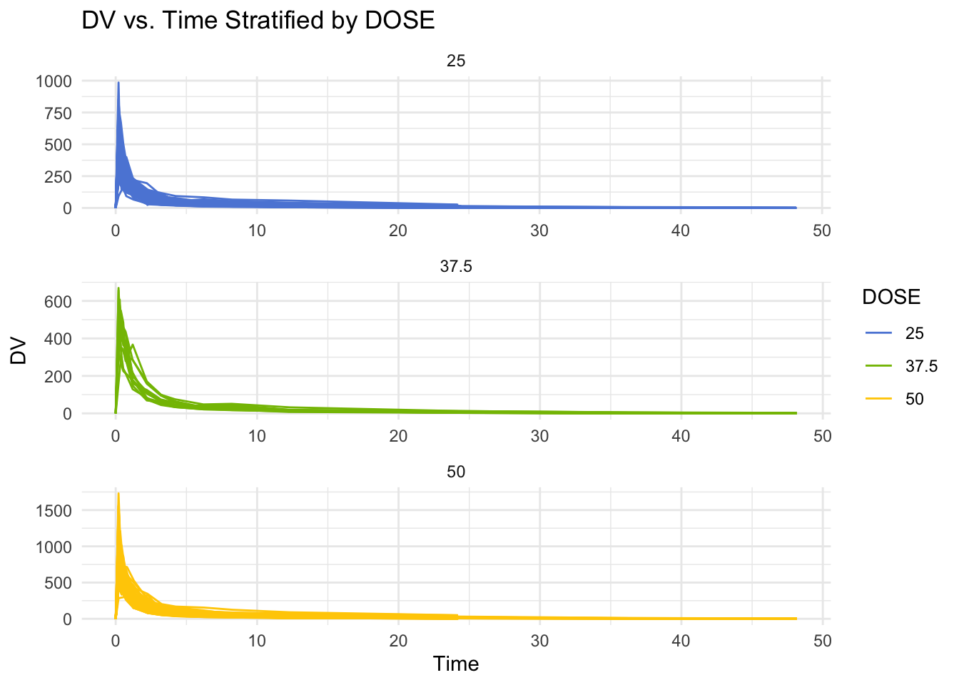
Data Processing
Loading in dplyr for data manipulation.
# Load dplyr for data malipulation
library(dplyr)
First, data is filtered to keep only rows where ‘OOC’ is equal to 1.
Then the first few rows of the dataframe are printed, to ensure that the data was filtered correctly.
# Filter the DataFrame to keep only rows where OCC equals 1
data1 <- subset(data, OCC == 1)

# Print the first few lines of the filtered dataframe
print(head(data1))
# A tibble: 6 × 17
ID CMT EVID EVI2 MDV DV LNDV AMT TIME DOSE OCC RATE AGE
<dbl> <dbl> <dbl> <dbl> <dbl> <dbl> <dbl> <dbl> <dbl> <dbl> <dbl> <dbl> <dbl>
1 793 1 1 1 1 0 0 25 0 25 1 75 42
2 793 2 0 0 0 491 6.20 0 0.2 25 1 0 42
3 793 2 0 0 0 605 6.40 0 0.25 25 1 0 42
4 793 2 0 0 0 556 6.32 0 0.367 25 1 0 42
5 793 2 0 0 0 310 5.74 0 0.533 25 1 0 42
6 793 2 0 0 0 237 5.47 0 0.7 25 1 0 42
# ℹ 4 more variables: SEX <dbl>, RACE <dbl>, WT <dbl>, HT <dbl>
Next, any observations where ‘TIME’ equals 0 are filtered out.
Then the sum of the DV variables are computed and assigned to variable Y.
Then a dataframe is created, which only contains observations where ‘TIME’ equals 0.
Finally, ‘inner_join’ is used to combine the dataframes.
# Filter out observations where TIME is not equal to 0
data_filtered <- filter(data1, TIME != 0)

# Compute the sum of the DV variable for each individual
Y <- data_filtered %>%
  group_by(ID) %>%
  summarize(Y = sum(DV))

# Create a dataframe containing only the observations where TIME equals 0
data_TIME_0 <- filter(data1, TIME == 0)

# Combine the two dataframes using the appropriate join function
combined_data <- inner_join(Y, data_TIME_0, by = "ID")
Next, ‘RACE’ and ‘SEX’ are converted to factor variables.
Then variables ‘Y’, ‘DOSE’, ‘AGE’, ‘SEX’, ‘RACE’, ‘WT’, and ‘HT’ are assigned to selected_data.
# Convert RACE and SEX to factor variables
combined_data <- combined_data %>%
  mutate(RACE = factor(RACE),
         SEX = factor(SEX))

# Select only the desired variables
selected_data <- combined_data %>%
  select(Y, DOSE, AGE, SEX, RACE, WT, HT)
Saving ‘selected_data’ to RDs file for use in module 11 exercise
# Save cleaned data to RDs file for use in Exercise 11
RDSfilepath <- here("ml-models-exercise", "cleandata.rds")
write_rds(selected_data, RDSfilepath)
Exploratory Data Analysis
Loading in packages for data exploration and visualization.
# Load tidyr, knitr, ggsci, and corrplot for data exploration and visualization
library(tidyr)
library(knitr)
library(ggsci)
library(corrplot)
To get a better idea of the variables, summary table is printed.
# Summary table for all variables
summary_data <- summary(selected_data[, c("Y", "DOSE", "AGE", "SEX", "RACE", "WT", "HT")])
print(summary_data)
Y DOSE AGE SEX RACE
Min. : 826.4 Min. :25.00 Min. :18.00 1:104 1 :74
1st Qu.:1700.5 1st Qu.:25.00 1st Qu.:26.00 2: 16 2 :36
Median :2349.1 Median :37.50 Median :31.00 7 : 2
Mean :2445.4 Mean :36.46 Mean :33.00 88: 8
3rd Qu.:3050.2 3rd Qu.:50.00 3rd Qu.:40.25
Max. :5606.6 Max. :50.00 Max. :50.00
WT HT
Min. : 56.60 Min. :1.520
1st Qu.: 73.17 1st Qu.:1.700
Median : 82.10 Median :1.770
Mean : 82.55 Mean :1.759
3rd Qu.: 90.10 3rd Qu.:1.813
Max. :115.30 Max. :1.930
Creating a scatterplot for ‘Y’ vs ‘DOSE’.
# Define colors
colors <- c("#cc1c00", "#5c88da", "#84bd00", "#ffcd00")

# Create the scatterplot of Y vs. DOSE
ggplot(selected_data, aes(x = DOSE, y = Y)) +
  geom_point(aes(color = DOSE), alpha = 0.6, size = 3) +
  scale_color_gradientn(colors = colors) +
  labs(title = "Y vs. DOSE", x = "Dose", y = "Y") +
  theme_minimal() +
  theme(plot.title = element_text(hjust = 0.5, size = 20),
        axis.title.x = element_text(face="bold", size = 14),
        axis.title.y = element_text(face="bold", size = 14),
        legend.title = element_blank())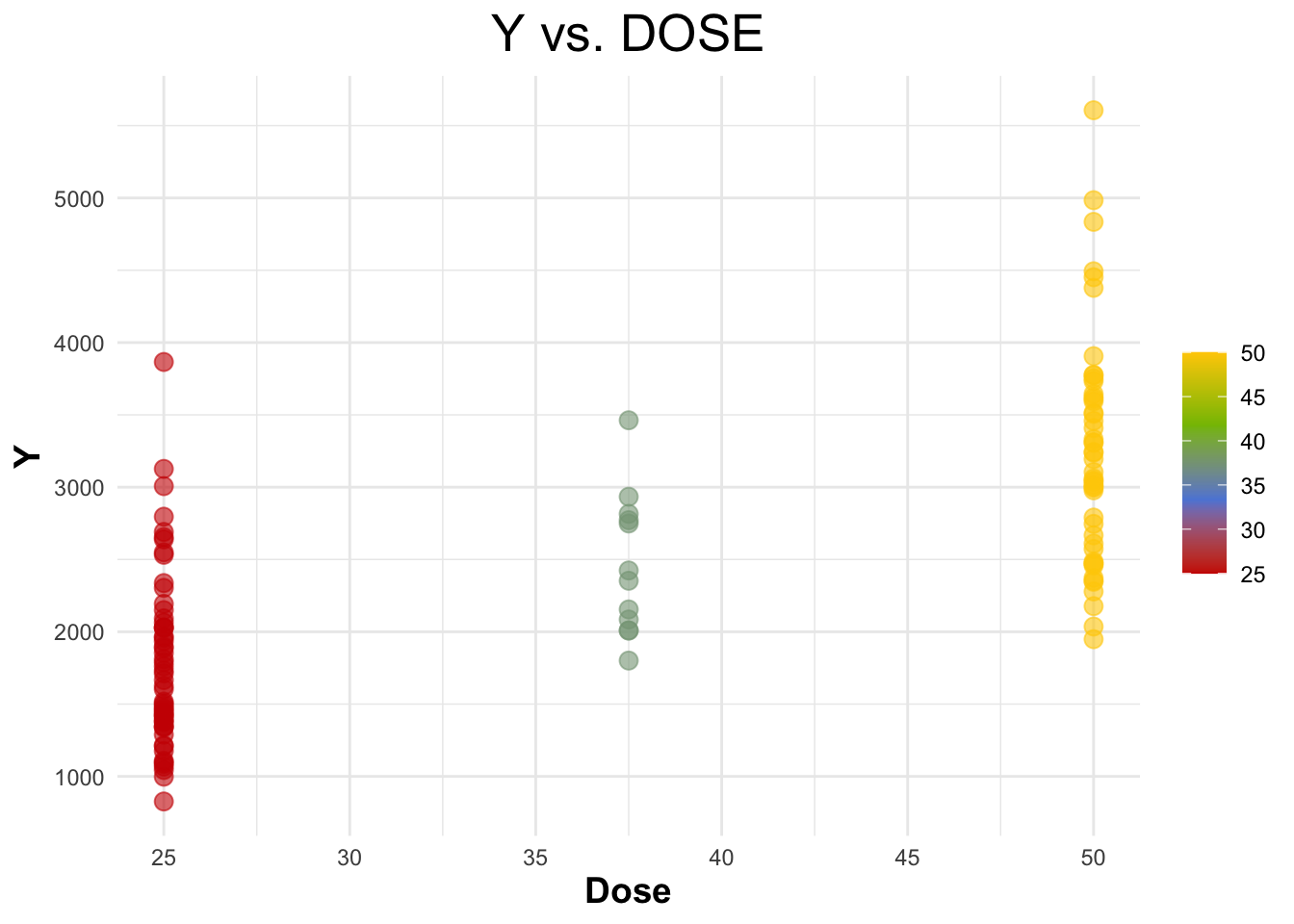
Creating a scatterplot for ‘Y’ vs ‘AGE’.
# Scatterplot of Y vs. AGE
ggplot(selected_data, aes(x = AGE, y = Y)) +
  geom_point(aes(color = AGE), alpha = 0.6, size = 3) +
  scale_color_gradient(low = "#5c88da", high = "#ffcd00") +
  labs(title = "Y vs. AGE", x = "Age", y = "Y") +
  theme_minimal() +
  theme(plot.title = element_text(hjust = 0.5, size = 20),
        axis.title.x = element_text(face="bold", size = 14),
        axis.title.y = element_text(face="bold", size = 14),
        legend.title = element_text(size = 14))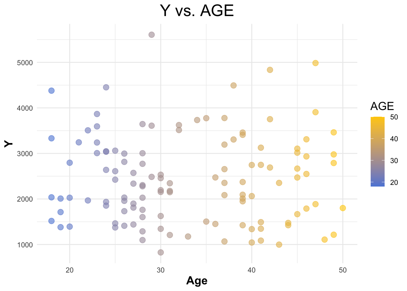
Creating a boxplot for ‘Y’ vs ‘SEX’.
# Boxplot of Y vs. SEX
ggplot(selected_data, aes(x = as.factor(SEX), y = Y, fill = as.factor(SEX))) +
  geom_boxplot() +
  scale_fill_startrek() +
  labs(title = "Y vs. SEX", x = "Sex", y = "Y") +
  theme_minimal() +
  theme(legend.title = element_blank(),
        plot.title = element_text(hjust = 0.5),
        axis.title.x = element_text(face="bold"),
        axis.title.y = element_text(face="bold"))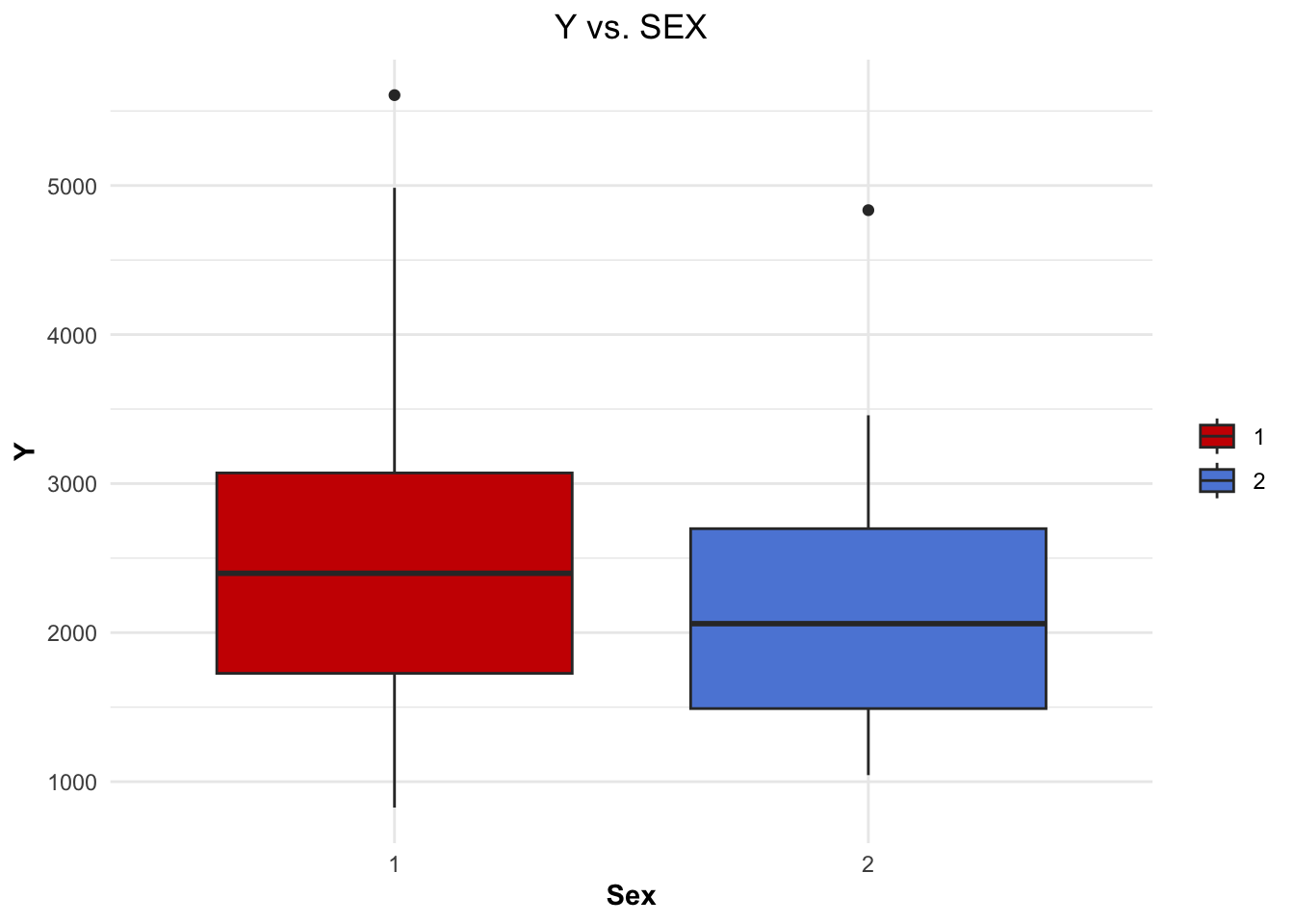
Creating a boxplot for ‘Y’ vs ‘RACE’.
# Boxplot of Y vs. RACE
ggplot(selected_data, aes(x = as.factor(RACE), y = Y, fill = as.factor(RACE))) +
  geom_boxplot() +
  scale_fill_startrek() +
  labs(title = "Y vs. RACE", x = "Race", y = "Y") +
  theme_minimal() +
  theme(legend.title = element_blank(),
        plot.title = element_text(hjust = 0.5),
        axis.text.x = element_text(angle = 90, vjust = 0.5, hjust=1),
        axis.title.x = element_text(face="bold"),
        axis.title.y = element_text(face="bold"))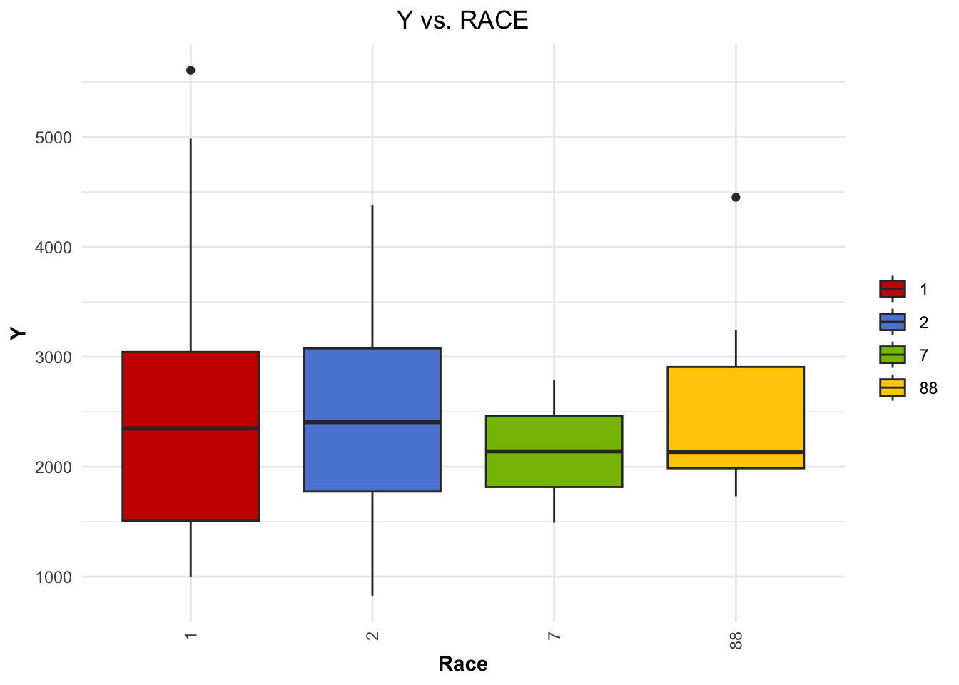
Creating distribution curves for ‘WT’ and ‘HT’.
# Distribution of WT with density curve
ggplot(selected_data, aes(x = WT)) +
  geom_histogram(aes(y = ..density..), binwidth = 1, fill = "#5c88da", color = "black") +
  geom_density(alpha = 0.5, color = "black") +
  theme_minimal() +
  ggtitle("Distribution of WT")
Warning: The dot-dot notation (`..density..`) was deprecated in ggplot2 3.4.0.
ℹ Please use `after_stat(density)` instead.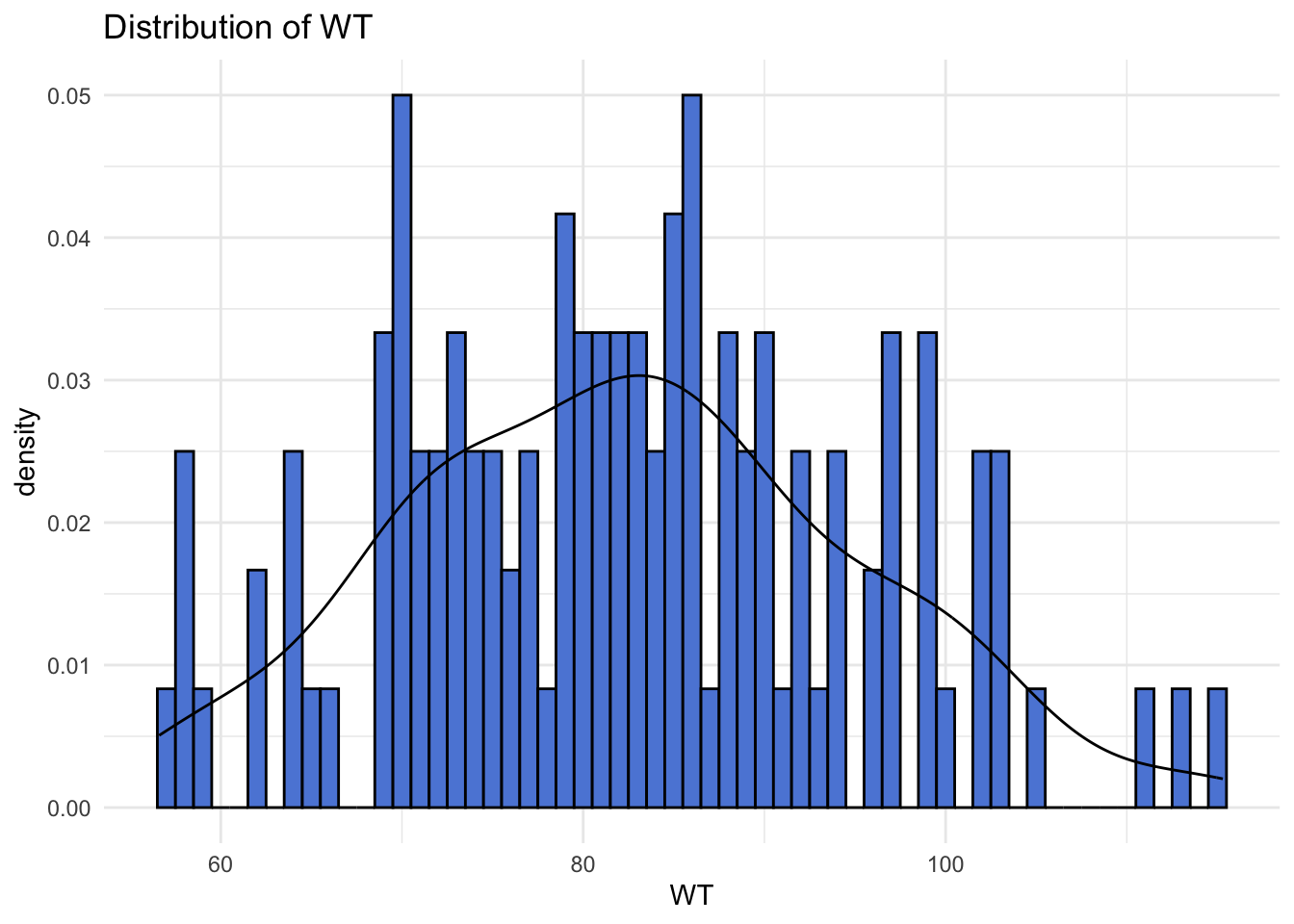
# Distribution of HT with density curve
ggplot(data, aes(x = HT)) +
  geom_histogram(aes(y = ..density..), fill = "#ffcd00", color = "black") +
  geom_density(alpha = 0.5, color = "black") +
  theme_minimal() +
  ggtitle("Distribution of HT")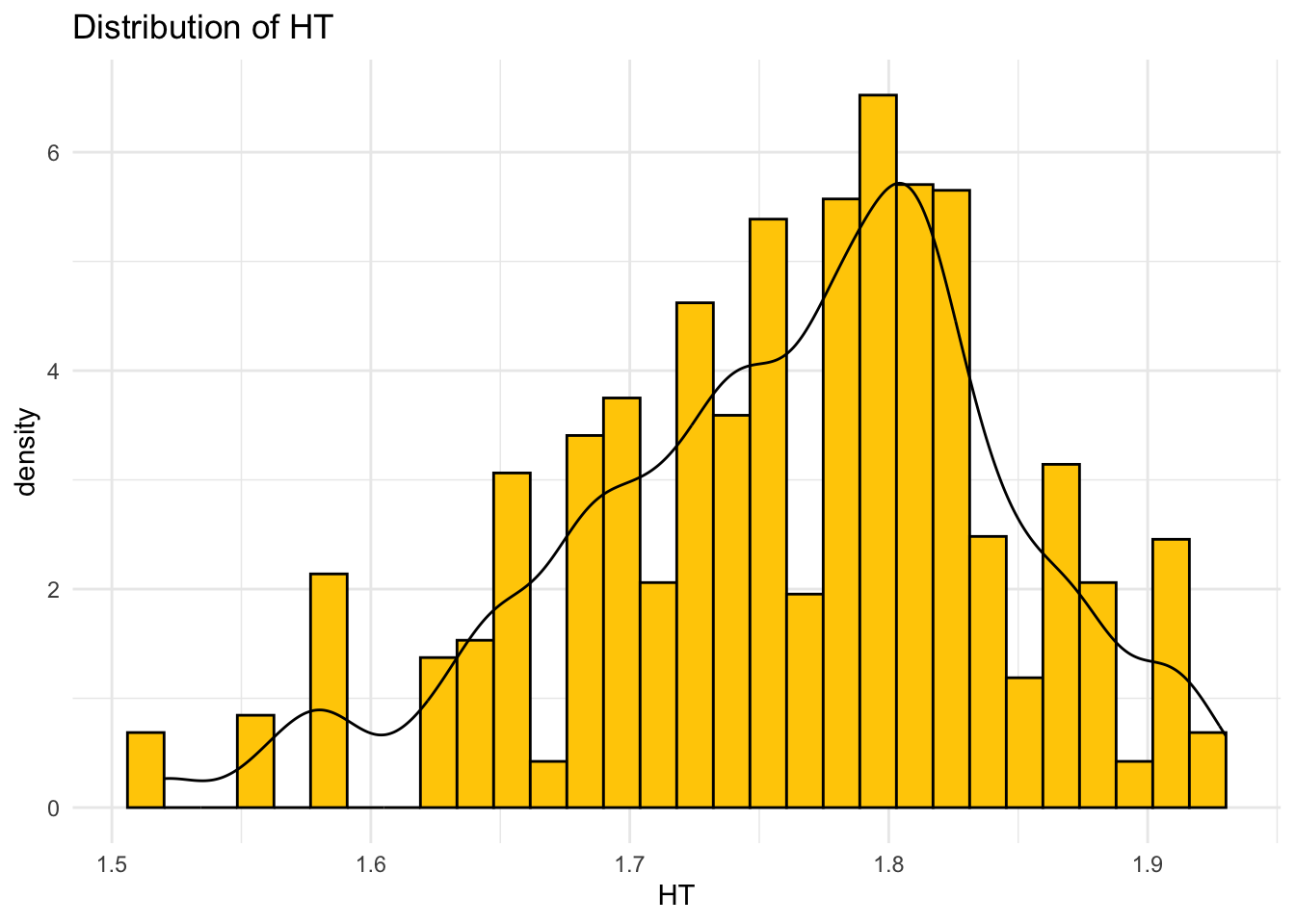
Plotting correlation matrix.
# Convert variables_of_interest to numeric
variables_of_interest <- as.data.frame(sapply(selected_data, as.numeric))

# Calculate correlation matrix for the variables of interest
corr_matrix <- cor(variables_of_interest, use = "complete.obs")

# Your custom colors
my_colors <- colorRampPalette(c("#5c88da", "white", "#ffcd00"))(200)

# Plotting the correlation matrix with custom colors
corrplot(corr_matrix, method = "color", col = my_colors,
         tl.col="black", tl.srt=45) # Text label color and rotation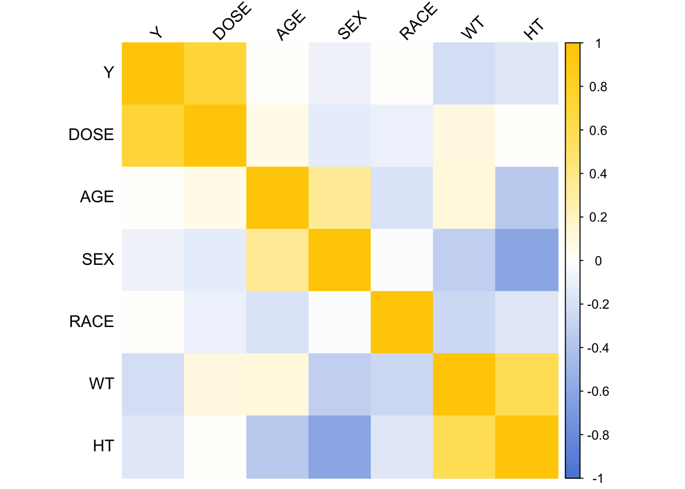
Model Fitting
Loading in tidymodels for model fitting.
# Load tidymodels for model fitting
library(tidymodels)
Linear Models
Models were fitted to the continuous outcome ‘Y’.
Defining the linear model specification.
# Define the model specification
linear_spec <- linear_reg() %>%
  set_engine("lm") %>%
  set_mode("regression")
Fitting model with ‘DOSE’ as the predictor.
# Model with DOSE as predictor
# Fit the model
model_dose <- linear_spec %>%
  fit(Y ~ DOSE, data = selected_data)

# Summarize the model
summary(model_dose$fit)
Call:
stats::lm(formula = Y ~ DOSE, data = data)

Residuals:
     Min       1Q   Median       3Q      Max
-1284.91  -441.14   -97.22   325.84  2372.87

Coefficients:
            Estimate Std. Error t value Pr(>|t|)
(Intercept)  323.062    199.049   1.623    0.107
DOSE          58.213      5.194  11.208   <2e-16 ***
---
Signif. codes:  0 '***' 0.001 '**' 0.01 '*' 0.05 '.' 0.1 ' ' 1

Residual standard error: 672.1 on 118 degrees of freedom
Multiple R-squared:  0.5156,    Adjusted R-squared:  0.5115
F-statistic: 125.6 on 1 and 118 DF,  p-value: < 2.2e-16
Calculating RMSE and R-squared for ‘DOSE’ model.
# RMSE and R-squared for model with DOSE
rmse_dose <- model_dose %>%
  predict(new_data = selected_data) %>%
  bind_cols(selected_data) %>%
  metrics(truth = Y, estimate = .pred) %>%
  filter(.metric %in% c("rmse", "rsq"))

print(rmse_dose)
# A tibble: 2 × 3
.metric .estimator .estimate
<chr> <chr> <dbl>
1 rmse standard 666.
2 rsq standard 0.516
Fitting model with all predictors.
# Model with all predictors
# Fit the model
model_all <- linear_spec %>%
  fit(Y ~ ., data = selected_data)

# Summarize the model
summary(model_all$fit)
Call:
stats::lm(formula = Y ~ ., data = data)

Residuals:
     Min       1Q   Median       3Q      Max
-1480.86  -367.81   -79.95   266.15  2431.52

Coefficients:
            Estimate Std. Error t value Pr(>|t|)
(Intercept) 3386.863   1835.153   1.846 0.067623 .
DOSE          59.935      4.880  12.281  < 2e-16 ***
AGE            3.155      7.825   0.403 0.687530
SEX2        -357.734    216.928  -1.649 0.101957
RACE2        155.034    128.627   1.205 0.230650
RACE7       -405.320    448.189  -0.904 0.367768
RACE88       -53.505    244.668  -0.219 0.827296
WT           -23.047      6.395  -3.604 0.000471 ***
HT          -748.487   1103.979  -0.678 0.499188
---
Signif. codes:  0 '***' 0.001 '**' 0.01 '*' 0.05 '.' 0.1 ' ' 1

Residual standard error: 614.3 on 111 degrees of freedom
Multiple R-squared:  0.6193,    Adjusted R-squared:  0.5919
F-statistic: 22.57 on 8 and 111 DF,  p-value: < 2.2e-16
Calculating RMSE and R-squared for all predictors model.
# RMSE and R-squared for model with all predictors
rmse_all <- model_all %>%
  predict(new_data = selected_data) %>%
  bind_cols(selected_data) %>%
  metrics(truth = Y, estimate = .pred) %>%
  filter(.metric %in% c("rmse", "rsq"))

print(rmse_all)
# A tibble: 2 × 3
.metric .estimator .estimate
<chr> <chr> <dbl>
1 rmse standard 591.
2 rsq standard 0.619
The lower RMSE and MAE values for the all predictors model compared to the ‘DOSE’ model indicate better accuracy in predicting Y when all predictors are considered.
The higher R-squared value for the all predictors model suggests that it does a better job in explaining variance in the data.
Logistic Models
Models were fitted to the categorical/binary outcome ‘SEX’.
Defining the logistic model specification.
# Define the model specification
logistic_spec <- logistic_reg() %>%
  set_engine("glm") %>%
  set_mode("classification")
Fitting model with ‘DOSE’ as the predictor.
# Fit the model
logistic_dose <- logistic_spec %>%
  fit(SEX ~ DOSE, data = selected_data)

print(logistic_dose)
parsnip model object
Call: stats::glm(formula = SEX ~ DOSE, family = stats::binomial, data = data)
Coefficients:
(Intercept) DOSE
-0.76482 -0.03175
Degrees of Freedom: 119 Total (i.e. Null); 118 Residual
Null Deviance: 94.24
Residual Deviance: 92.43 AIC: 96.43
Calculating ROC-AUC for ‘DOSE’ model.
# Accuracy and ROC-AUC for logistic model with DOSE
acc_dose <- logistic_dose %>%
  predict(new_data = selected_data, type = "prob") %>%
  bind_cols(selected_data) %>%
  roc_auc(truth = SEX, .pred_1)

print(acc_dose)
# A tibble: 1 × 3
.metric .estimator .estimate
<chr> <chr> <dbl>
1 roc_auc binary 0.592
Fitting model with ‘DOSE’ as the predictor.
# Model with all predictors
# Fit the model
logistic_all <- logistic_spec %>%
  fit(SEX ~ ., data = selected_data)

print(logistic_all)
parsnip model object
Call: stats::glm(formula = SEX ~ ., family = stats::binomial, data = data)
Coefficients:
(Intercept) Y DOSE AGE RACE2 RACE7
60.32525 -0.00104 -0.03076 0.08340 -1.92738 0.11763
RACE88 WT HT
-1.50012 -0.06283 -33.19601
Degrees of Freedom: 119 Total (i.e. Null); 111 Residual
Null Deviance: 94.24
Residual Deviance: 32.08 AIC: 50.08
Calculating ROC-AUC for all predictors model.
# Accuracy and ROC-AUC for logistic model with all predictors
acc_all <- logistic_all %>%
  predict(new_data = selected_data, type = "prob") %>%
  bind_cols(selected_data) %>%
  roc_auc(truth = SEX, .pred_1)

print(acc_all)
# A tibble: 1 × 3
.metric .estimator .estimate
<chr> <chr> <dbl>
1 roc_auc binary 0.980
Both models show a significant amount of error (RMSE) and a moderate amount of variance (R-squared).
However, including all predictors marginally improves both the RMSE and R-squared values, indicating a better predictive fit.
K-Nearest Neighbor
Loading in kknn for nearest neighbor.
# Load kknn for nearest neighbor
library(kknn)
K-Nearest neighbors model for continuous outcome ‘Y’.
# K-Nearest Neighbors Model for Continuous Outcome (Y)
# Define KNN model specification for regression
knn_spec_regression <- nearest_neighbor(neighbors = 5) %>%  # You can adjust the number of neighbors
  set_engine("kknn") %>%
  set_mode("regression")

# Fit KNN model for Y with DOSE as the predictor
knn_fit_Y_DOSE <- knn_spec_regression %>%
  fit(Y ~ DOSE, data = selected_data)

# Fit KNN model for Y with all predictors
knn_fit_Y_all <- knn_spec_regression %>%
  fit(Y ~ ., data = selected_data)

# Assuming you have a test dataset or you split your selected_data into training and testing
set.seed(123)  # For reproducibility
data_split <- initial_split(selected_data, prop = 0.8)
train_data <- training(data_split)
test_data <- testing(data_split)

# Predictions
predictions_Y_DOSE <- predict(knn_fit_Y_DOSE, new_data = test_data) %>%
  bind_cols(test_data)

predictions_Y_all <- predict(knn_fit_Y_all, new_data = test_data) %>%
  bind_cols(test_data)

# Compute RMSE and R-squared for both models
metrics_Y_DOSE <- metrics(predictions_Y_DOSE, truth = Y, estimate = .pred)
metrics_Y_all <- metrics(predictions_Y_all, truth = Y, estimate = .pred)

cat("Y DOSE\n")
print(metrics_Y_DOSE)
cat("\n")
cat("Y All Predictors\n")
print(metrics_Y_all)
Y DOSE
# A tibble: 3 × 3
.metric .estimator .estimate
<chr> <chr> <dbl>
1 rmse standard 576.
2 rsq standard 0.562
3 mae standard 458.
Y All Predictors
# A tibble: 3 × 3
.metric .estimator .estimate
<chr> <chr> <dbl>
1 rmse standard 395.
2 rsq standard 0.773
3 mae standard 329.
K-Nearest neighbors model for categorical outcome SEX.
# K-Nearest Neighbors Model for Categorical Outcome (SEX)
# Define KNN model specification for classification
knn_spec_classification <- nearest_neighbor(neighbors = 5) %>%  # Adjust neighbors as needed
  set_engine("kknn") %>%
  set_mode("classification")

# Fit KNN model for SEX with DOSE as the predictor
knn_fit_SEX_DOSE <- knn_spec_classification %>%
  fit(SEX ~ DOSE, data = selected_data)

# Fit KNN model for SEX with all predictors
knn_fit_SEX_all <- knn_spec_classification %>%
  fit(SEX ~ ., data = selected_data)

# Predictions
predictions_SEX_DOSE <- predict(knn_fit_SEX_DOSE, new_data = test_data, type = "prob") %>%
  bind_cols(test_data)

predictions_SEX_all <- predict(knn_fit_SEX_all, new_data = test_data, type = "prob") %>%
  bind_cols(test_data)

# Compute Accuracy and ROC-AUC for both models
metrics_SEX_DOSE <- roc_auc(predictions_SEX_DOSE, truth = SEX, .pred_1) # Adjust based on factor levels
metrics_SEX_all <- roc_auc(predictions_SEX_all, truth = SEX, .pred_1)

cat("SEX DOSE\n")
print(metrics_SEX_DOSE)
cat("\n")
cat("SEX All Predictors\n")
print(metrics_SEX_all)
SEX DOSE
# A tibble: 1 × 3
.metric .estimator .estimate
<chr> <chr> <dbl>
1 roc_auc binary 0.409
SEX All Predictors
# A tibble: 1 × 3
.metric .estimator .estimate
<chr> <chr> <dbl>
1 roc_auc binary 1
Exercise 10
Setup
Load nessecary libraries and assign random seed value.
# Load required libraries
library(dplyr)

# Assign seed value to `rngseed`
rngseed = 1234
Remove variable RACE from dataset, and set random seed.
# Remove RACE variable from data
data_pt10 <- select(selected_data, -RACE)

# Set random seed
set.seed(rngseed)
Data Splitting
Split data into training data and test data. Data is split at a 3 to 4 ratio, with 75 training data and .25 test data.
# Splitting the data
data_split <- initial_split(data_pt10, prop = 3/4)

# Create data frames for the training and test sets
train_data <- training(data_split)
test_data  <- testing(data_split)
Model Fitting
Load required libraries and set seed for reproducability.
# Load required libraries
library(tidymodels)
library(dplyr)
Fit linear models with Y as the outcome.
linfit1 uses DOSE as the predictor. linfit2 uses all predictors.
# Fit linear models with Y as outcome
lin_mod <- linear_reg() %>% set_engine("lm")
linfit1 <- lin_mod %>% fit(Y ~ DOSE, data = train_data) # only DOSE as predictor
linfit2 <- lin_mod %>% fit(Y ~ ., data = train_data) # all predictors
Computing RMSE and R-squared scores for both models.
# Compute the RMSE and R squared for DOSE
metrics_1 <- linfit1 %>%
  predict(train_data) %>%
  bind_cols(train_data) %>%
  metrics(truth = Y, estimate = .pred)

# Compute the RMSE and R squared for all predictors model
metrics_2 <- linfit2 %>%
  predict(train_data) %>%
  bind_cols(train_data) %>%
  metrics(truth = Y, estimate = .pred)

# Print the results
cat("DOSE Model\n")
print(metrics_1)
cat("\n")
cat("All Predictors Model\n")
print(metrics_2)
DOSE Model
# A tibble: 3 × 3
.metric .estimator .estimate
<chr> <chr> <dbl>
1 rmse standard 703.
2 rsq standard 0.451
3 mae standard 546.
All Predictors Model
# A tibble: 3 × 3
.metric .estimator .estimate
<chr> <chr> <dbl>
1 rmse standard 627.
2 rsq standard 0.562
3 mae standard 486.
Fit null model.
# Fit null model
nullfit <- lin_mod %>% fit(Y ~ 1, data = train_data)
Compute RMSE and R-squared scores for null model.
# Compute the RMSE and R squared for the null model
metrics_null <- nullfit %>%
  predict(train_data) %>%
  bind_cols(train_data) %>%
  metrics(truth = Y, estimate = .pred)

# Print the results for the null model
cat("Null Model\n")
print(metrics_null)
Null Model
# A tibble: 3 × 3
.metric .estimator .estimate
<chr> <chr> <dbl>
1 rmse standard 948.
2 rsq standard NA
3 mae standard 765.
Resampling Model Assessment
Load required libraries, and set seed for reproducability.
# Load required libraries
library(tidymodels)
library(dplyr)

# Set the seed for reproducibility
set.seed(rngseed)
Create CV folds. We are using a 10-fold cross-validation.
# Create CV Folds
cv_folds <- vfold_cv(train_data, v = 10, strata = NULL)
Creating workflows for DOSE and all predictors models.
# Creating workflows

# DOSE model
workflow_dose <- workflow() %>%
  add_model(lin_mod) %>%
  add_formula(Y ~ DOSE)

# All predictors model
workflow_all <- workflow() %>%
  add_model(lin_mod) %>%
  add_formula(Y ~ .)
Fitting the models with resampling, and calculating RMSE and R-squared values.
# DOSE model
cv_results_dose <- fit_resamples(
  workflow_dose,
  cv_folds,
  metrics = metric_set(rmse, rsq)
)

# All predictors model
cv_results_all <- fit_resamples(
  workflow_all,
  cv_folds,
  metrics = metric_set(rmse, rsq)
)
Summarizing model results.
# Summarize model results
cat("DOSE Model with Resampling\n")
collect_metrics(cv_results_dose)
cat("\n")
cat("All Predictors Model with Resampling\n")
collect_metrics(cv_results_all)
DOSE Model with Resampling
# A tibble: 2 × 6
.metric .estimator mean n std_err .config
<chr> <chr> <dbl> <int> <dbl> <chr>
1 rmse standard 691. 10 67.5 Preprocessor1_Model1
2 rsq standard 0.512 10 0.0592 Preprocessor1_Model1
All Predictors Model with Resampling
# A tibble: 2 × 6
.metric .estimator mean n std_err .config
<chr> <chr> <dbl> <int> <dbl> <chr>
1 rmse standard 646. 10 64.8 Preprocessor1_Model1
2 rsq standard 0.573 10 0.0686 Preprocessor1_Model1
Comparing Results
Dose Models
As can be seen in the charts below, the model with resampling is a slightly better fit than the model without. The RMSE of the model with resampling (691) is lower than the RMSE of the model without resampling (703), indicating a better fit. The R-squared of the model with resampling (0.512) is slightly higher than the model without resampling (.451), indicating a better fit.
cat("DOSE Model with Resampling\n")
collect_metrics(cv_results_dose)
cat("\n")
cat("DOSE Model\n")
print(metrics_1)
DOSE Model with Resampling
# A tibble: 2 × 6
.metric .estimator mean n std_err .config
<chr> <chr> <dbl> <int> <dbl> <chr>
1 rmse standard 691. 10 67.5 Preprocessor1_Model1
2 rsq standard 0.512 10 0.0592 Preprocessor1_Model1
DOSE Model
# A tibble: 3 × 3
.metric .estimator .estimate
<chr> <chr> <dbl>
1 rmse standard 703.
2 rsq standard 0.451
3 mae standard 546.
All Predictors Models
As can be seen in the charts below, the model with resampling is a slightly better fit than the model without, but not as good an improvement as with the DOSE models. The RMSE of the model with resampling (646) is actually higher than the RMSE of the model without resampling (627), suggesting a slight increase in prediction errors with the resampling model. The R-squared of the model with resampling (0.573) is slightly higher than the model without resampling (0.562), indicating a better fit. Though this increase is not as notable as the one seen with the DOSE models.
cat("All Predictors Model with Resampling\n")
collect_metrics(cv_results_all)
cat("\n")
cat("All Predictors Model\n")
print(metrics_2)
All Predictors Model with Resampling
# A tibble: 2 × 6
.metric .estimator mean n std_err .config
<chr> <chr> <dbl> <int> <dbl> <chr>
1 rmse standard 646. 10 64.8 Preprocessor1_Model1
2 rsq standard 0.573 10 0.0686 Preprocessor1_Model1
All Predictors Model
# A tibble: 3 × 3
.metric .estimator .estimate
<chr> <chr> <dbl>
1 rmse standard 627.
2 rsq standard 0.562
3 mae standard 486.
Using a New Seed
This follows the same steps as above, but with a new random seed of 042.
Setting seed for reproducability, and creating CV folds.
# Set the seed for reproducibility
set.seed(42)

# Create CV Folds
cv_folds <- vfold_cv(train_data, v = 10, strata = NULL)
Creating workflows for DOSE and all predictors models.
# DOSE model
workflow_dose <- workflow() %>%
  add_model(lin_mod) %>%
  add_formula(Y ~ DOSE)

# All predictors model
workflow_all <- workflow() %>%
  add_model(lin_mod) %>%
  add_formula(Y ~ .)
Fitting the models with resampling, and calculating RMSE and R-squared values.
# DOSE model
cv_results_dose <- fit_resamples(
  workflow_dose,
  cv_folds,
  metrics = metric_set(rmse, rsq)
)

# All predictors model
cv_results_all <- fit_resamples(
  workflow_all,
  cv_folds,
  metrics = metric_set(rmse, rsq)
)
Summarizing model results.
# Summarize model results
cat("(New Seed) DOSE Model with Resampling\n")
collect_metrics(cv_results_dose)
cat("(New Seed) All Predictors Model with Resampling\n")
collect_metrics(cv_results_all)
(New Seed) DOSE Model with Resampling
# A tibble: 2 × 6
.metric .estimator mean n std_err .config
<chr> <chr> <dbl> <int> <dbl> <chr>
1 rmse standard 696. 10 63.8 Preprocessor1_Model1
2 rsq standard 0.460 10 0.0853 Preprocessor1_Model1
(New Seed) All Predictors Model with Resampling
# A tibble: 2 × 6
.metric .estimator mean n std_err .config
<chr> <chr> <dbl> <int> <dbl> <chr>
1 rmse standard 642. 10 55.8 Preprocessor1_Model1
2 rsq standard 0.507 10 0.0845 Preprocessor1_Model1
Comparing Results (Again)
Dose Models
As can be seen in the charts below, the model with resampling is a slightly better fit than the model without. The RMSE of the model with resampling (696) is lower than the RMSE of the model without resampling (703), indicating a better fit. The R-squared of the model with resampling (0.461) is slightly higher than the model without resampling (.451), indicating a better fit.
cat("(New Seed) DOSE Model with Resampling\n")
collect_metrics(cv_results_dose)
cat("\n")
cat("DOSE Predictors Model\n")
print(metrics_1)
(New Seed) DOSE Model with Resampling
# A tibble: 2 × 6
.metric .estimator mean n std_err .config
<chr> <chr> <dbl> <int> <dbl> <chr>
1 rmse standard 696. 10 63.8 Preprocessor1_Model1
2 rsq standard 0.460 10 0.0853 Preprocessor1_Model1
DOSE Predictors Model
# A tibble: 3 × 3
.metric .estimator .estimate
<chr> <chr> <dbl>
1 rmse standard 703.
2 rsq standard 0.451
3 mae standard 546.
All Predictors Models
As can be seen in the charts below, the model with resampling is not overall a much better fit than without resampling. The RMSE of the model with resampling (642) is actually higher than the RMSE of the model without resampling (627), suggesting a slight increase in prediction errors with the resampling model. The R-squared of the model with resampling (0.507) is slightly lower than the model without resampling (0.562), indicating a similar or worse fit.
cat("All Predictors Model with Resampling\n")
collect_metrics(cv_results_all)
cat("\n")
cat("All Predictors Model\n")
print(metrics_2)
All Predictors Model with Resampling
# A tibble: 2 × 6
.metric .estimator mean n std_err .config
<chr> <chr> <dbl> <int> <dbl> <chr>
1 rmse standard 642. 10 55.8 Preprocessor1_Model1
2 rsq standard 0.507 10 0.0845 Preprocessor1_Model1
All Predictors Model
# A tibble: 3 × 3
.metric .estimator .estimate
<chr> <chr> <dbl>
1 rmse standard 627.
2 rsq standard 0.562
3 mae standard 486.
Thoughts
Both runs of the resampling followed a similar pattern when run even with different random seeds. The DOSE models showed a better fit with resampling, while the all predictors models showed little to no indication of a better fit.
This section added by Ranni Tewfik.
First let’s create a figure that plots observed values versus predicted values for the three original model fits to all of the training data.
#Compute the predicted values for the three models
predicted1 <- predict(linfit1, new_data = train_data)
predicted2 <- predict(linfit2, new_data = train_data)
predictednull <- predict(nullfit, new_data = train_data)

#Create a data frame with the observed values and predicted values from the three models
predictions <- data.frame(
  observed = train_data$Y,
  model1 = predicted1,
  model2 = predicted2,
  null = predictednull)

#Create a figure that plots observed values on the x-axis and predicted values on the y-axis
ggplot(predictions, aes(x = observed)) +
  geom_point(aes(y = .pred, color = "Model 1"), alpha = 0.7) +
  geom_point(aes(y = .pred.1, color = "Model 2"), alpha = 0.7) +
  geom_point(aes(y = .pred.2, color = "Null Model"), alpha = 0.7) +
  geom_abline(intercept = 0, slope = 1, linetype = "dashed", color = "black") +
  xlim(0, 5000) +
  ylim(0, 5000) +
  labs(x = "Observed Values", y = "Predicted Values", title = "Observed vs. Predicted Values for Three Models") +
  theme_minimal()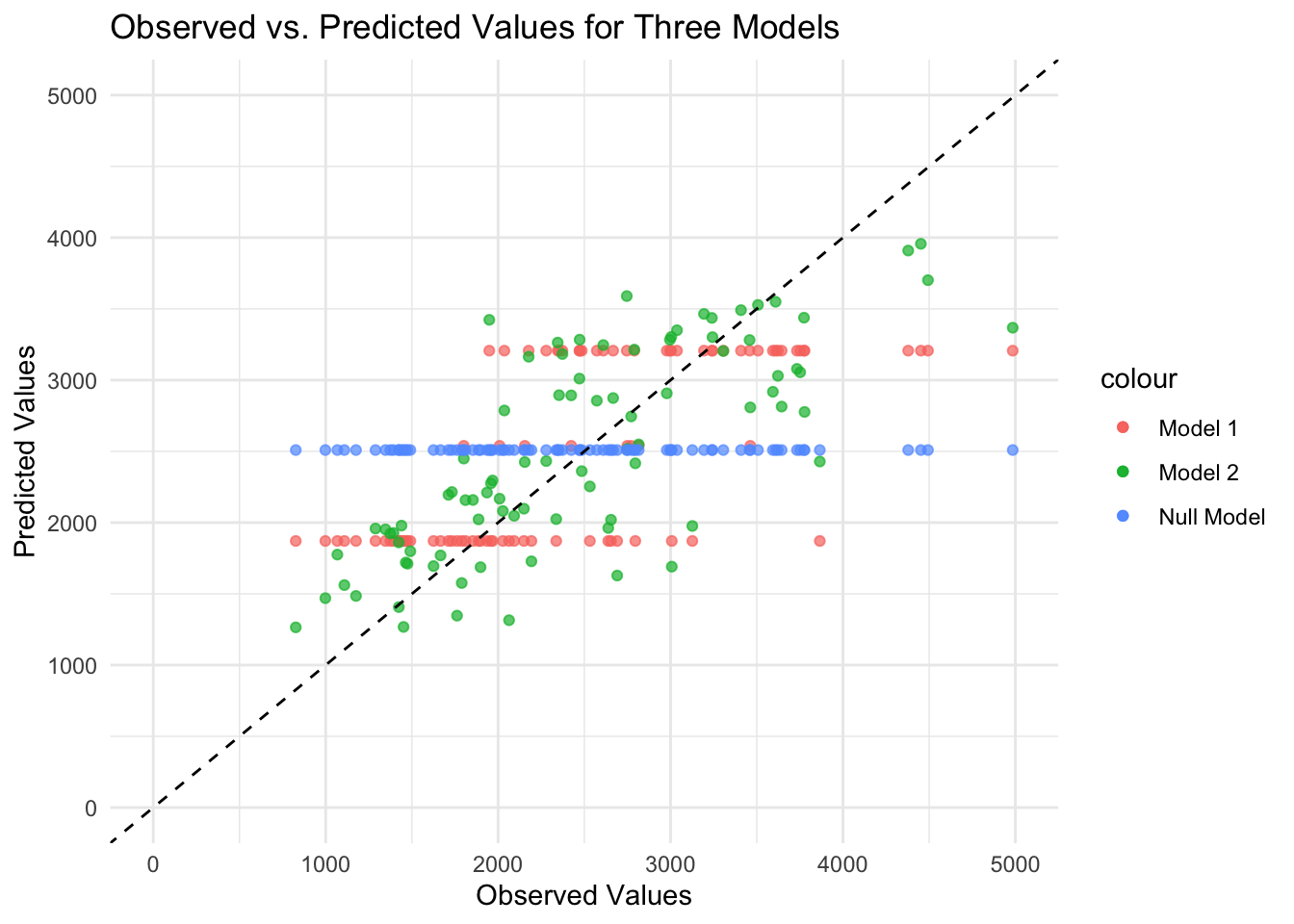
As expected, the predicted values from the null model are a straight horizontal line because the same value (mean) is predicted for each observation. For Model 1 with only DOSE as the predictor, the data fall along three horizontal lines (i.e., only three different predicted values for the outcome) because the DOSE variable takes only three values. Model 2 with all predictors looks the best because the points fall relatively along the dashed diagonal line (i.e., observed and predicted values generally agree), although there is some scatter along the diagonal line. There seems to be a pattern to the scatter, as the predicted values are lower than the observed values for high values. Perhaps there are aspects of the outcome pattern that the model cannot explain.
Now let’s create a figure that plots predicted values versus residuals for Model 2.
#Fit the linear model for all predictors and create a data frame
linmodel2 <- lm(Y ~ ., data = train_data)
linmodel2f <- fortify(linmodel2)

#Create a figure that plots predicted values on the x-axis and residuals on the y-axis
ggplot(linmodel2f, aes(x = .fitted, y = .resid)) +
  geom_point() +
  geom_hline(yintercept = 0, linetype = "dashed") +
  ylim(-2500, 2500) +
  labs(x = "Predicted Values", y = "Residuals", title = "Predicted Values vs. Residuals for Model 2") +
  theme_minimal()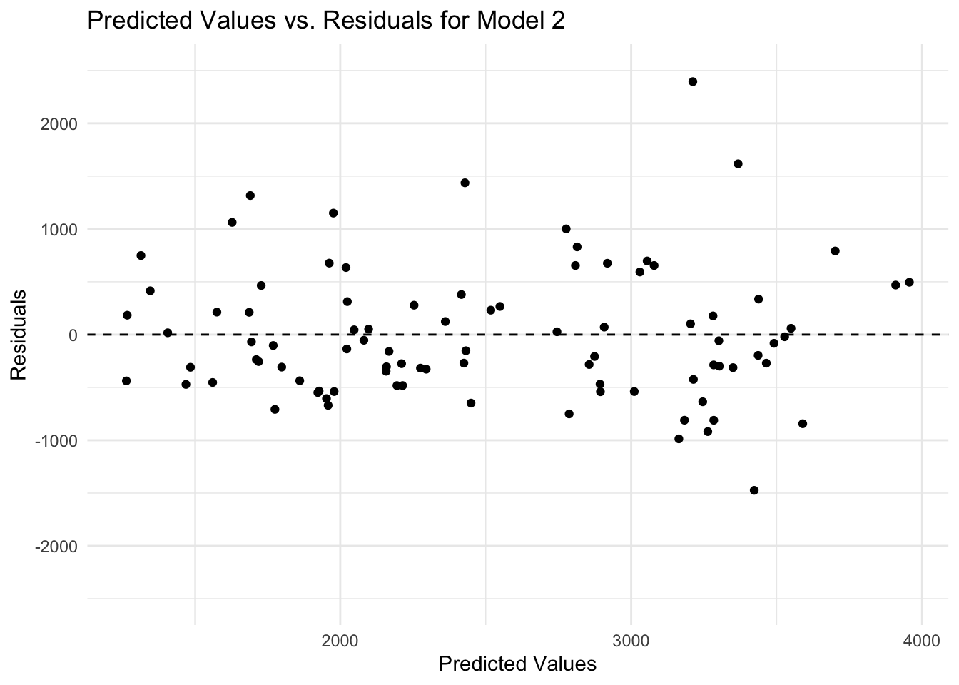
There is a discernible pattern in the plot of predicted values versus residuals, as there are more and higher negative values of residuals compared to positive values. It may be that more variables are needed (i.e., important information is missing) or that the model is too simple (i.e., the outcome depends on some variable in a nonlinear relationship).
Finally, let’s use the bootstrap method to sample the data, fit Model 2 to the data, and measure uncertainty in our predictions. Let’s create a figure that plots observed versus predicted values for Model 2.
#Load the required package
library(rsample)
library(boot)

#Set a seed
rngseed = 1234
set.seed(rngseed)

#Create 100 bootstraps using the training data
dat_bs <- bootstraps(train_data, times = 100)

#Create an empty matrix to store predictions
pred_bs <- matrix(nrow = nrow(train_data), ncol = 100)

#Use a loop to fit Model 2 to each bootstrap sample and make predictions for the training data
for(i in 1:100) {
  dat_sample <- analysis(dat_bs$splits[[i]])
  model <- lm(Y ~ ., data = dat_sample)
  predictions <- predict(model, newdata = train_data)
  pred_bs[, i] <- predictions
}

#Compute the median and 89% confidence intervals
preds <- apply(pred_bs, 1, function(x) {quantile(x, c(0.055, 0.5, 0.945))}) %>% t()
preds <- data.frame(preds)

#Add the median and confidence intervals to the same data frame as the observed and predicted values for Model 2
linmodel2f$lower <- preds$X5.5.
linmodel2f$median <- preds$X50.
linmodel2f$upper <- preds$X94.5.

#Create a figure that plots observed values on the x-axis and predicted values on the y-axis
ggplot(linmodel2f, aes(x = Y)) +
  geom_point(aes(y = .fitted, color = "Point Estimates"), alpha = 0.7) +
  geom_point(aes(y = lower, color = "Lower Bounds"), alpha = 0.7) +
  geom_point(aes(y = median, color = "Medians"), alpha = 0.7) +
  geom_point(aes(y = upper, color = "Upper Bounds"), alpha = 0.7) +
  geom_abline(intercept = 0, slope = 1, linetype = "dashed", color = "black") +
  xlim(0, 5000) +
  ylim(0, 5000) +
  labs(x = "Observed Values", y = "Predicted Values", title = "Observed vs. Predicted Values for Model 2") +
  theme_minimal()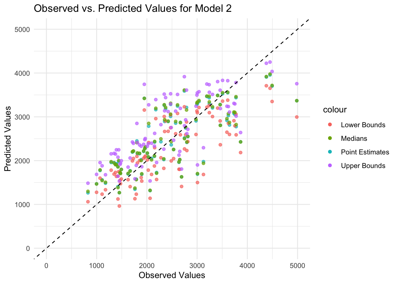
In general, the medians and confidence intervals in the plot follow the same diagonal pattern as the point estimates (i.e., observed and predicted values generally agree), although there is some scatter along the diagonal line. Because some predicted values are lower than the observed values for high values, there may be aspects of the outcome that the model cannot explain.
Final Evaluation
Gathering predictions for testing and training data.
# Predictions for the training data
predictions_train <- predict(linfit2, new_data = train_data) %>%
  bind_cols(train_data) %>%
  mutate(dataset = "Training")

# Predictions for the test data
predictions_test <- predict(linfit2, new_data = test_data) %>%
  bind_cols(test_data) %>%
  mutate(dataset = "Test")
Combining predictions in to one data frame for plotting purposes.
# Combine the predictions into one data frame
predictions_combined <- bind_rows(predictions_train, predictions_test)
Plotting the graph using ggplot.
# Creating the plot
ggplot(predictions_combined, aes(x = Y, y = .pred)) +
  geom_point(aes(shape = dataset, color = dataset), alpha = 0.7, size = 3) +
  geom_abline(intercept = 0, slope = 1, linetype = "dashed", color = "grey40", size = 1) +
  scale_shape_manual(values = c("Training" = 16, "Test" = 17)) + # Circle and triangle
  scale_color_manual(values = c("Training" = "#ffcd00", "Test" = "#5c88da")) +
  labs(x = "Observed Values",
       y = "Predicted Values",
       title = "Comparison of Observed vs. Predicted Values",
       subtitle = "Includes both Training and Test Data") +
  theme_minimal(base_size = 14) +
  theme(legend.title = element_blank(),
        legend.position = "bottom",
        plot.title = element_text(size = 20, face = "bold"),
        plot.subtitle = element_text(size = 16),
        axis.title.x = element_text(size = 16, face = "bold"),
        axis.title.y = element_text(size = 16, face = "bold"),
        legend.text = element_text(size = 14)) +
  guides(color = guide_legend(override.aes = list(size = 6)))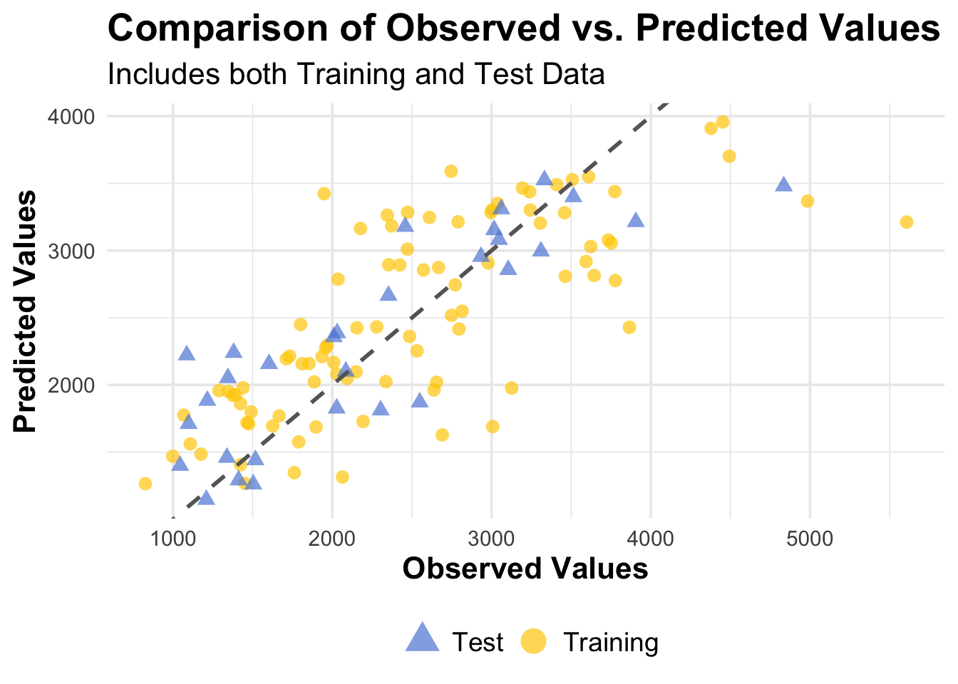
Overall Model Assessment
Both model 1 and model 2 performed better than the null model, which was expected to be the case.
The DOSE model, while not much better than the null model, technically does improve results over the null model. I think the results of the DOSE model do make sense given there being only one predictor and thus limited observation of complexity within the data, however, I would not consider this model usable for any real purposes.
Model 2 (all predictors model) does further improve results. The results here also make sense, as now there are many more predictors, which allow the model to capture more complexity and variance within the data. I would consider this model usable (depending on the application), though there is certainly room for improvement and further adjustment.